|
A close study of book covers transmits a remarkable amount of information: clues to contemporary literary taste; cover design history; publishing practices; target audience. A cover may facilitate, distort, or put a new spin on the text it encloses. It may speak for the author, for the publisher, for the designer, or grab all the attention for itself. The paradigm of the book cover as speaker is integral to this essay, which focuses on the packaging—bindings, covers, jackets—of Jane Austen’s works, a topic that largely has been overlooked. Through selected examples of Austen book covers from 1811 to the most recent electronic edition, I intend to provide a cover story to go with and give a life beyond the meanings of her printed pages. A cover to an Austen novel speaks not only of the piece it enfolds but also about the marketing and understanding of Austen’s work. As such, a cover completes its text, giving it a voice that another cover alters. Why do covers to Austen’s texts take on so many different voices? Do these voices reflect or change the way Austen is read?1
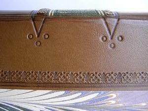
The covers—more properly called “boards”—for Austen’s first editions tell us much about the history of book binding and the practices of today’s rare book market but little about the initial marketing or reception of Austen’s novels. When T. Egerton published Sense and Sensibility in 1811, he followed the utilitarian practice of using his own “publisher’s binding.” Sheets of a book were first encased in a binding made by the publisher. Customarily the purchaser would then have the book uniquely rebound. As preeminent book collector Michael Sadleir cautions in The Evolution of Publisher’s Binding Styles, an original binding is “more elusive than may at first sight be realized” (1). The title printed on a paper label affixed to the spine was the only way to distinguish one novel from another—the covers of original bindings were unmarked. Indeed, the gradual establishment of paper title labels for spines is the most significant change in the look of a publisher’s binding from the 1780s to the time of Austen’s 1811 edition.
Sadleir, in fact, singles out an Austen binding because it lacks a paper title label. Included in a section of his study identified as “Non-Labelled Freaks,” an 1813 copy of Pride and Prejudice lacks the printed label that was typical for the time period, its spine unadorned, with the exception of a volume number (Evolution 19). He emphasizes how “definitely irregular” this condition was and surmises that “from [its] appearance,” it was a copy “boarded up for some exceptional reason after the date of regular publication, after perhaps the supply of printed labels had run out” (19). Sadleir’s emphasis demonstrates the significance of what—to a novice—may appear to be a slight alteration in the binding of a book. The “freakish” condition of its cover not only increases its value for collectors but provides room for speculation about its unusual condition—spinning a story all its own.
The authenticity of a binding carries more weight in today’s rare-book market than aesthetics or function. For example, Peter Harrington Antiquarian Books advertises a first edition of Emma for $42,087.18 with the following promotion: “We think it likely that this copy was not bound on purchase like most copies, but rebound sympathetically in keeping with the original at a slightly later stage, when the fragile boards disintegrated.” In comparison, they promote a much more attractive and well constructed, yet less expensive first edition for $30,863.93: “Contemporary mottled calf, neatly rebacked to Regency style, covers with gilt scroll borders.”
The latter example is not only less tattered looking, it is also more practical—its reconstruction protects the pages it envelops. Even so, an original cover in fair condition is more valuable than a reconstructed binding in excellent condition.
David Gilson elaborates on Sadleir’s point in his introduction to A Bibliography of Jane Austen, explaining why collectors seek first editions of Austen and how views on their proper bindings have fluctuated: “the wealthy bibliophile of the turn of the [last] century . . . would have the copies he could find put into luxurious bindings, . . . whereas the more recent collector who cannot aspire to original boards has learnt to prefer the neat full or half-bindings of JA’s own day” (3). He continues with quite a lengthy explanation about the near impossibility of identifying an original binding with half-titles, concluding with the disclaimer that “I cannot guarantee even that all copies seen of apparent first editions . . . are indeed true first editions (although most, almost all of these must be so)” (4-5). Today’s market clearly puts the higher value on the cover that is “somehow full of the spirit of the period,” as Geoffrey Keynes puts it (qtd. in Gilson 3). This valuation suggests that the pages of text and its original envelope function as one piece of art, much like a painting and its frame. The book’s flaws become part of its history. Once the original components are fractured or separated, the value decreases. Whereas the “unassuming half-leather” cover or original publisher’s binding served a utilitarian purpose in the past, in today’s market they have acquired an aesthetic value because of its original, or close to original, state.
With the onset of World War II, yet another utilitarian purpose for the Austen book cover becomes significant. An increased demand among the troops for Austen and other British novelists (especially Dickens, Hardy, and Austen) inspired Penguin and other publishers to size books to fit uniform pockets. These pocket editions followed the Book Production Economy Standard, which meant, among other things, smaller covers. In 1942, an air raid “gutted Paternoster Row, the hub of book trade,” destroying several firms that published Austen, including Methuen, George Allen and Unwin, and George G. Harrap (Rose 351). At the same time, the demand for Austen’s novels burgeoned: her works boosted morale among the war-weary. In response to the increasing demand and war-time restrictions, covers made from resilient if unattractive materials such as biscuit cloth and buckram were produced. For example, Roger Ingram put out an edition of Pride and Prejudice specially bound to withstand frequent use. In “heavy grey cloth boards,” it included this publisher’s note:
Owing to the scarcity of copies of Pride and Prejudice available for general reading, a scarcity which exists over the whole field of classical literature, it has been felt that some amelioration of the position would be created by the issue of a special library edition. This edition, while conforming to the War Economy Agreement in the matter of typography and paper, is bound in a way that will make the book stand up to library conditions of use without the rapid deterioration common to most books issued in recent years. (Gilson 319)
The utilitarian Austen cover—the original bindings and those conforming to war-time economy standards—seems to take on a symbiotic relationship with its text. Original bindings are like swaddling clothes, untainted by the vulgarity of fashion; the war-time covers are like thick skins, holding together a world for a reader whose life is on the line. Each speaks to a heightened experience for the life of a text preserved through its cover—times when the book as a whole carries more meaning than it would bear at other points. The utilitarian Austen cover is freighted with greater significance than others because it reminds us both of the vulnerability of a text and of how much more a text is than simply words on a page.
Hawking Austen: cosmetic exposure
The cosmetics of book covers became significant on a large scale around 1820 once boards as encasements were replaced with cloth bindings. Mass production of Austen novels started with the enterprising publisher Richard Bentley. He bought five of the six copyrights from Cassandra Austen in 1832, and, beginning with Sense and Sensibility, he issued each in his Standard Novels series. Bentley’s covers were the first to include a sales strategy that not so much caught the eye but rather replaced the eye. Anthony Rota in Apart From the Text details how the Bentley “get up” proved ingenious not so much for its cover look, but for its cover “feel” (119). Poor lighting forced shopkeepers to grope among dark bookshelves. On the spines and covers, Bentley included a wide range of ornaments that one could feel: “nibs, rugosities, and other crenellations” (119). The texture of the Bentley cover was recognizable; chances were that a missing Bentley title would be noticed quickly and selected for re-order over others (119). Louis Braille published his Method of Writing Words, Music and Plain Song by Means of Dots in 1829, and the Braille method may have inspired Bentley to fashion not only a cover look but also a cover feel for promotional purposes.
In the mid-1800s, the cover look for an Austen novel became quite significant as traditional covers begin to compete with other covers known as “yellowbacks.” These books were atypical in their small size and inexpensive price. Marketed mainly for railway reading, yellowbacks were sold in railway bookstalls. Sadleir scrupulously details the history of the yellowback with illustrations and description. The front cover usually bore an illustration pertaining to the text while the spine also carried a design or a picture. Yellowbacks were bound in straw boards covered with glazed colored paper—always bright, but not always yellow. The paper was block printed with pictures using a technique perfected by Edmund Evans (King 4, 69, 169). Published as part of the Railway Library series by George Routlege, the yellowback is often considered a “pioneer venture in cheap book publishing” when actually, as Sadleir notes, “[I]t was a deliberate and not altogether scrupulous imitation of the Parlour Library, which it sedulously copied in outward appearance as well as in appeal for public favour” (XIX Century Fiction 167).
Green glazed boards printed in brown, and dark green fine-ribbed cloth with gold decoration on the spine, could be counted on to catch to eye of Parlour Library addicts and tempt them to purchase. In actual design of boardcovers, the Railway Library was more enterprising than its prototype, but no superiority in decorative detail can absolve it from the charge of deliberate “passing off.” (168)
As Sadleir also illustrates, advertising on the back cover evolved over the years from publishers’ promotions to commercial advertisements. Back covers of the yellowback series often promoted products as diverse as Pears’ Soap or Fry’s Cocoa. “Looked at from any angle,” Rota comments, “the yellowback was a remarkable source of entertainment and information” (221).
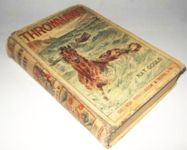
In the typical conveniently-sized cover for commuter reading, Sense and Sensibility (1849) was No. 8 in the Railway Library yellowback published by Routledge, whose firm came to dominate the yellowbacks. Austen’s novels—with some surprisingly attention-grabbing covers—were sold at railway stations alongside a wide range of brightly covered fiction, often of questionable merit.
The Railway Library 1849 edition of Sense and Sensibility exemplifies the sensational appeal of the yellowback cover: in this case, an overwrought Marianne Dashwood is on her knees at her writing desk, obviously distressed as she writes to Willoughby. A commuter may have picked up Austen’s book willy-nilly because of these covers, thinking it on par with any number of less regarded fictions.
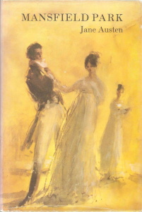
Mansfield Park and Emma were both published by Routledge during the “golden age” (1855-1870) of the yellowbacks when “publishers strove to develop house styles,” and the “results were quite elegant-looking books” (Rota 226). David Gilson describes the “glazed orange/red paper boards” that comprise the cover of the 1857 yellowback Mansfield Park (247). Gilson also discloses that the cover illustration is anachronistic: it dresses Fanny Price, Edmund Bertram, and Mary Crawford in costumes appropriate to 1857, the time of its issue (247).
From this period, the Routledge firm began fully exploiting the cover space. An increasing number of publishers were in competition; each tried to outdo the other with new designs and combinations and make a profit through advertising on the cover (King xvii). An amusing example of a later edition of Pride and Prejudice (1883) advertised patent medicines on its lower boards while its upper boards depicted the stomach-churning marriage proposal from Collins to Elizabeth—an unintended juxtaposition. Humor aside, the changes in these covers demonstrated that Routledge was beginning to take account of the space—not only to give readers a “teaser” from the novel itself but also to advertise products independent of the novel.
Routledge was also the first publisher to use heightened versions of scenes from Austen’s novels for book covers. For example, in 1883 the Routledge Edition of Sense and Sensibility had upper boards with an unsigned wood-engraved illustration showing Marianne Dashwood recovering from her tumble with the aid of Willoughby, who gallantly raises her from the ground “in company with quite a large dog rather than the little black bitch pointer mentioned by Sir John Dashwood” (Gilson 258). The covers of other 1883 Routledge Editions feature scenes with potential melodrama. As Gilson notes, “Emma’s upper board illustrates Harriet Smith and the gipsies” [sic], Mansfield Park displays “Fanny and Edmund with the necklace,” and the cover of Northanger Abbey features “Catherine Morland opening the cabinet” (259-61).
In addition to being listed under the yellowback and Routledge Edition brand names, Austen titles appeared on numerous covers in the realm of “series publishing,” a domain that burgeoned in the latter part of the nineteenth century (Rota 213-20). They were listed among those from Dick’s English Library, The Seaside Library, The Select Library of Fiction, the Manchester Library Series, Penny Library, Rainbow Library, Florin Library, Handy Library, and Cassell’s National Library—to name some. The latter achieved the most success as a “library series” reaching total sales of approximately seven million volumes (Rota 228). Visually, brand association linked Austen’s novels, rightly or wrongly, to others in the same series and put her books into the hands of that “great lubberly brat”—as the London periodical Athenaeum dubbed the reading public (Rota 219). In Jane Austen’s Textual Lives, Kathryn Sutherland finds that the inclusion of Austen in this “rash” of cheap series novels is an “index of her growing popularity” (4). Another possibility is that the identical covers of the novels within a series made the Austen novel just another book within an already well-liked and easily identifiable sequence. Her growing popularity could be the result of as well as an index to her inclusion within the realm of series publishing. Rather than reaching for Austen intentionally, the hand of the “great lubberly brat” simply may have reached for the trademark of a familiar cover—and by chance picked Austen.
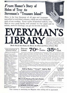
The Everyman (1906) and Penguin (1935) trademarks of the twentieth century became familiar to the general public in similar ways. Both marketed Austen. Jane Austen, in fact, is the first British author (followed by Dickens) to have her complete works included in the Everyman collection. Her prominence in the Everyman collection speaks to her significant commercial appeal by the turn of the century. Ernest Rhys describes the ideal end-product of the Everyman edition in terms of its cover. Yellowback publisher Routledge could have promoted his series with a similar spin:
What we were after, one and all, was to produce a book which would be pleasant to see and to handle, with a cheerful outside, and print easy to read and good for the eyes within—tempting to look at on the shelf, and of a size convenient for the pocket, one that could be taken for a country ramble or for a railway journey or on shipboard. (qtd. in Anderson)
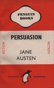
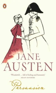
Penguin’s bright covers, with the reader on the go in mind, also recall the yellowbacks in the railway stalls a century earlier. Like the yellowback, the easily recognizable Penguin cover was spotted from a distance and distributed—though not in railway bookstalls but rather in machines called Penguincubaters. Rota records the installation of the first dispenser in 1937 “outside Collet’s bookshop in Charing Cross Road,” not far from the bustle of London public transportation (234). Penguin featured Austen’s novels in both its classic series and its fiction series, changing its stationary penguin cover logo to a dancing penguin on the 1943 paperback covers of Northanger Abbey and Persuasion.
Holding their tongues: seen but not read
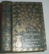
Other editions, however, targeted consumers who purchased Austen quite deliberately, even if only to impress others. These editions were not for travel but for enjoyment in one’s home or for display. For example, in 1892 J. M. Dent issued The Novels of Jane Austen in Ten Volumes, in “[g]reenish-white smooth cloth, spine gilt, upper board gilt with title and volume number . . . in a cartouche topped with the Austen crest, and a facsimile signature” of Jane Austen (Gilson 263-64). Two years later George Allen issued Pride and Prejudice in what came to be heralded among elite circles as the “‘Peacock’ design, . . . all edges gilt” (Gilson 267). In 1908-1909 Chatto and Windus produced a limited edition for which the front board of each cover featured a small, oval, color illustration reproducing a watercolor drawing by Wallis Mills. Over the next decade or so, among book owners who could afford to buy books for their covers—for décor—a book’s cover, as apart from its content, began to become an emblem in and of itself.
Partially in response to book décor, or “a book-styled home” (Benton 9), the relationship between books and their owners became a topic of interest around the third decade of the twentieth century, as Megan Benton discusses in “Too Many Books: Book Ownership and Cultural Identity in the 1920s.” Articles began to crop up in periodicals, disdaining book buyers who treated books as books as “things . . . to impress the neighbors [or] deliver professional and social advantages” (2). Benton points out that although book buying increased exponentially, “a significant part of these book sales represents an anxious response to the enticements and pressures posed within the advertisements for the books themselves” (8). For example, “The Harvard Classics series, better known as Dr. Eliot’s Five-Foot Shelf of Books” was marketed less for “personal intellectual growth” than for “the impression one would make on others” (8).
Possessing Austen’s Pride and Prejudice, then, part of Charles Eliot’s series, represented what Benton describes as “civic duty.” To have the copy of Austen and the other Harvard Classics was the first step to “productive citizenship” according to Vice-President Calvin Coolidge, who wrote on the subject (8). Books were essential for “the heart” of any home (8). Indeed, “books were considered so essential to the good life that their absence was downright ominous” (10).
On the other hand, using the mere face of a Jane Austen novel or any “beautifully bound classics, which you feel you should have read,” to create an ambience of sophistication was condemned by the doyenne of etiquette, Emily Post. Book covers are potential agents of deception, and to “fill your rooms with books you know you will never open, rather than with those you like, . . . is to produce the same impression of misfit as if you wore a mask and wig” warned Post (qtd. in Benton 11).
First impressions: covers and art
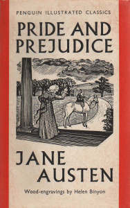
In 1938, the Penguin Press revived the illustrated cover for Austen novels. To distinguish its classics series from its fiction series, Penguin hired artists (and credited them on the front cover) to illustrate a selected scene for the cover of the novel. These covers were the first to use an illustration of a scene from the novel since the infamous yellowbacks. A wood engraving by Helen Binyon graced Pride and Prejudice, No. 2 of the Illustrated Classics series of 1938 (Gilson 312).
The chosen scene—Jane Bennet departing for Netherfield, riding side-saddle, with Mrs. Bennet waving her off—suggests a type of female odyssey. By depicting the young woman’s separation from the comforts of home, Binyon’s illustration emphasizes the moments of uncertainty in the novel rather than the heightened romanticism found in the earlier illustrated covers of the yellowbacks.
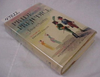
The spate of renowned cover designers and illustrators for Austen novels in the 1940s indicates not only a golden age for cover design but also the regard publishers had for Austen novels—an indicator that at least certain segments of the public held Austen in esteem. The 1945 Doubleday, Doran & Company edition of Pride and Prejudice was the first edition to identify its cover designer (as distinct from the illustrator): A. P. Tedesco (Gilson 316). In 1946, World Publishing used Ernst Reichl’s design for the same novel (Gilson 317). Reichl had made his name in 1934, when the ban for obscenity was lifted, with the cover design of the first American edition of James Joyce’s Ulysses (Drew and Sternberger 9). Reichl’s design for Pride and Prejudice uses type in a dramatic style that dominates the cover.
He directed illustrator Edgard Cirlin, who placed two male characters—neither one the hero—in the foreground. In the background, two elongated female figures face away. These choices suggest a complex view of gender relationships somewhat unusual for 1946, particularly after the simplistic interpretation of Pride and Prejudice in the 1940 Greer Garson film. Reichl likely was responsible for this strategy: he was of the “first generation of designers dedicated to integrating the cover with the interior, . . . to embrace the book cover design as a serious endeavor” (Drew and Sternberger 24).
The covers of other Austen editions of this era were designed by Joseph Blumenthal and P. J. Conkwright, two of the six designers invited to design Kafka’s The Trial, sponsored by Hammermill Paper Company. Other noteworthy designers of Austen covers included Stephan Salter (brother of renowned designer Georg Salter), Robert Wallace, William B. Taylor, Richard Ellis, and Jane Grabhorn (Gilson 781). John Sergeant, cover designer for Zodiac Press, used yellow as a background (recalling the nineteenth-century yellowbacks once again) to emphasize rather misleading and lurid representations of the book’s content. For example, his dreamlike illustration for Mansfield Park features a firm, strong man, legs apart, pulling a translucent-looking young woman by the wrist into his chest. The swirling yellow background includes another wispy young woman looking on.
Echoes from the past: cover reproductions
Starting in the mid 1960s, covers of Austen novels began to shift away from using original art. Instead, the trend was to contextualize the work with reproductions of paintings and portraits, sometimes an inaccurate contextualization from a geographical, chronological, or social viewpoint. Unlike illustrations using original art, these images suggested—often falsely—a literal representation from the novel, usually an image of the heroine. The portraits of wealthy, often aristocratic women, for example, misled readers who might have imagined the heroines in their likeness. Austen has few women in her novels who enjoy the economic status of the women who grace these covers—the clothing, jewelry, hairstyle, complexion could be all wrong.
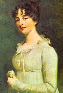
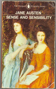
The first portrait gracing a cover appeared in 1966. Emma was represented by Marcia Fox, painted by Sir William Beechey, the artist appointed court portraitist by Queen Charlotte, George III’s consort (Gilson 354). Other early examples include Penguin’s 1969 paperback edition of Sense and Sensibility, showing Thomas Gainsborough’s “The Linley Sisters,” and the same firm’s 1972 detail from Henry Raeburn’s portrait of “Lady Colville” on Pride and Prejudice (Gilson 358, 363).
The wide use of reproductions on Austen covers continues today. The decision to use reproductions rather than original art may be based on publishers’ speculation that Austen readers yearn for an escape into the past, an escape presumably offered by paintings contemporary to Jane Austen’s time. The clichéd landscapes and beautifully coifed women on these covers prepare one for a quixotic novel-reading experience—far from what a careful reader finds.
Spirit of the Times: Iconic Covers
Some inexpensive paperback editions of Austen in the 1960s experimented with contemporary color combinations and cover art that captured the “mod” culture of the time. The designers and illustrators go unnamed, but the artists behind these covers typically emphasized the female image in the abstract. For example, the purple-bordered, pink cover of the 1964 Signet is interrupted with a corner slice of turquoise. The main female figure (with a modern hairstyle, hair caught back in what appears to be a barrette), blank face in profile, turns to the turquoise space filled by six persons in decidedly period dress. This cover suggests a vision of a young woman looking back in time.
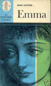
The cover of the 1965 Everyman paperback Emma, on the other hand, features a close-up of a young woman’s face seen through a blue and green screen of color. Her distressed, huge eyes look to one side, like a rendition of a Warhol-like silkscreen print. These covers link the novels to current times, contemporizing Austen’s themes rather than confining them in another time and place in the manner of reproductions of early nineteenth-century art.
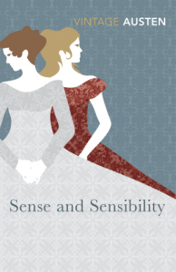
Although little effort toward modernization appeared in the 1980s or 1990s, in August 2007 Vintage Press released editions in covers that again capture a contemporary feel. The website “Première de Couverture” records the recent repackaging of Austen:
To design the new covers, Vintage showed competing sets of classics to focus groups of “archetypal ABC1 [middle class] readers.” The groups felt Oxford University Press titles were “quite forbidding and academic”; Penguin Classics had a “stamp of quality and collectability, but look as if they’ll be hard going”; and the new Penguin Reds were “patronizing.” Vintage then trialled prototypes of its rebranded classics, only to be told that readers wanted more “simple and approachable” jackets. . . . The publisher eventually chose a single “iconic” image for each cover. (“Summer 2007”)
The Vintage covers, unlike those that proclaim Austen’s novel as period pieces, simply nod to the time frame. Each of the six Vintage Austen novels features a woman or women designed to fill the page with open, full, figures. The Vintage editions offer readers clean lines in place of fussy detail. A few combinations of muted, contemporary tones comprise the color scheme, the simplicity contrasting with the busyness of reproductions. Period costumes are replaced with design. The configuration leaves no doubt as to the centrality of women to each novel. The lack of detail directs the beholder away from the cosmetic and toward a sense of interiority.
Sound- and sight-bites: covers filtered through film and photo
Beginning with Alexander Grosset and George Dunlap’s 1940 Motion Picture Edition of Pride and Prejudice, covers for Austen novels have featured film stars. The pictorial dust jacket of Grosset & Dunlap’s Pride and Prejudice shows a scene with Greer Garson and Laurence Olivier.
Doug Clausen, an authority on book bindings and proprietor of Clausen Books, clarifies the publisher’s strategy. Novels that featured stills on the covers and in inserts—properly called photoplays—enjoyed some popularity in the late 1930s and 1940s. Grosset & Dunlap was the leading publisher to use this marketing method. The photoplays were advertised in the movie theaters during the film’s run—right along with candy and gum (Clausen). The advent of television brought an end to the photoplay. After the Grosset & Dunlap edition of Pride and Prejudice, a fifty-five year gap exists before an actor again made an appearance on the cover of a novel by Jane Austen. From 1995 when the BBC aired Pride and Prejudice, however, a spate of celebrities, speaking to the reader who associates the film and text, has turned up on Austen covers: Jennifer Ehle, Emma Thompson, Kate Winslet, Hugh Grant, Colin Firth, Alan Rickman, Gwyneth Paltrow, and Keira Knightley. Recently, James McAvoy and Anne Hathaway have been showcased on random novels, earning the place by starring in the quasi-bio-movie Becoming Jane.
The film Becoming Jane resulted in further repackaging of Austen’s novels. One publisher decided that Jane Austen simply could not “face” them herself. This affront to Austen caught the attention of The Times (London) arts reporter Ben Hoyle: Becoming Jane, he implied, inspired “Wordsworth Editions, which sells millions of cut-price classic novels,” to deem Cassandra’s “authentic portrait of Jane Austen” as “too unattractive” for its covers. He quoted Wordsworth’s managing director, Helen Trayler:
The poor old thing didn’t have anything going for her in the way of looks. Her original portrait is very, very dowdy. It wouldn’t be appealing to readers, so I took it upon myself to commission a new picture of her. We’ve given her a bit of a makeover, with make-up and some hair extensions and removed her nightcap. Now she looks great—as if she’s just walked out of a salon. (Hoyle)
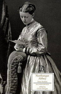
Broadview Press, on the other hand, makes bold—and sometimes unflattering—cover choices. Representing each novel through black and white photographic covers, regardless of the date of publication or the text, the Victorian cover photos are grainy, and the persons un-airbrushed.
The Editor of English Studies at Broadview, Marjorie Mather, disclosed that the decision on design was made at the series’ inception in 2000, driven by the desire for a distinctive and uniform look for the covers (Mather). Unlike the familiar reproductions of paintings that began appearing on many Austen covers beginning in the 1960s, Broadview favors the unfamiliar, perhaps jarring the onlooker into rethinking the theme, setting, or characters. Despite the anachronistic nature of the images, Broadview covers are very well-received for the most part, and many editors and instructors embrace the quirkier choices (Mather). “However,” Mather adds, “some opponents are quite vocal against the approach”:
Some scholars simply find the anachronism aesthetically jarring, while others say that students are confused by it. The historical context provided by the editions makes the ahistorical covers more problematic for some. The covers to Jane Austen editions are also especially contentious because readers tend to have a mental picture of her characters. As a rule, covers showing people are more bothersome than landscapes or architecture. But overall, I hear many more positive comments than negative. (Mather)
Speechless: screening covers
Covers, jackets, bindings, wrappers—all the familiar packaging for Austen may become obsolete with the advent of the new Kindle tablet, a device that makes reading electronic books replicate—with some snags—reading a “real” book.
As Lynn Neary reports in her piece “Taking Kindle to the Pool,” “People who like to read also like books—the feel of them in their hands, the look of the printed word on a paper page. So it’s no surprise that the advent of the electronic book has been greeted with a mixture of skepticism and curiosity.” Kindle and future reading devices force the questions: Just what comprises a book? Is a book the author’s words only? Do covers play an essential part? Although no covers exist for individual electronic books, Kindle itself does provide a wrapper. Reporting for the Washington Post, Robert Pegoraro states that “[t]hese books come wrapped in ‘digital rights management’ software that prevents you from printing them, reading them on another device or loaning them to friends” (D2). Hence, the cover has a new function—to literally “bind” up a book—from everyone but its owner. Book binding takes on a new and different meaning from its original conception!
The provenance of Austen covers begins with the impersonal “publisher’s bindings.” It ends with a “digital rights management” cover for words that exist electronically. These examples stand in contrast to those covers that create a “whimsical, chocolate-box idyll, reflecting a nostalgia for a lost pre-industrialized society” (Sutherland 6). Covers can be “loyal” to texts, simply illustrating scenes or characters with little interpretation on an artist’s part. Covers can provoke, shape, or jar readers into specific readings of Austen texts. Which do more honor to Austen’s texts? Can her words exist independently—words without the borders that covers supply?
A cover to a book may add only one material layer on each side of its text, but the layered construct provides the sense of integration and a sense of place—even if only virtual—to which we open ourselves. Book covers provide one layer of interest upon another to someone reading (or just handling) an edition of Austen. As a tangible agent, a cover to an Austen novel not only speaks to the piece it enfolds (or uploads), it also speaks about the marketing and understanding of Austen’s work. As such, a cover completes its text, giving it a voice that another cover would alter. Taken together, Austen covers provide a quasi-provenance of the textual life they surround. In addition to the capacity to transmit (even electronically) literary, historical, cultural, social, and economic information, a book cover provides a handhold for images, ideas, thoughts—the humanity that Austen imparts for us to embrace.
1. The 1997 edition of David Gilson’s A Bibliography of Jane Austen is the primary source for my paper, and I credit Gilson’s work for providing almost all of the examples of Austen’s texts. Without Gilson’s bibliography, an analysis of Austen’s packaging would not be feasible. Works Cited Anderson, Jeffrey S. “Collecting Everyman’s Library.” 5 May 2008 http://everymanslibrarycollecting.com. Benton, Megan. “‘Too Many Books’: Book Ownership and Cultural Identity in the 1920s.” American Quarterly 49(1997): 268-297. Clausen, Doug. Personal Interview. 10 Mar. 2008. Drew, Ned, and Paul Sternberger. By Its Cover. New York: Princeton Architectural P, 2005. Gilson, David. A Bibliography of Jane Austen. Corrected ed. New Castle, DE: Oak Knoll, 1997. Hoyle, Ben. “How to Shift Those Looks if the Author is Plain Jane.” The Times 23 Mar. 2007. 28 Nov 2008 http://entertainment.timesonline.co.uk/tol/arts_and_entertainment/books/article1555696.ece. King, Edmund M. B. Victorian Decorated Trade Bindings 1830-1880. London: British Library, 2003. Mather, Marjorie. Personal interview. 14 Mar. 2008. Neary, Lynn. “Taking Kindle to the Beach.” Morning Edition 7 July 2008. National Public Radio. 27 Jul. 2008 http://www.npr.org/templates/story/story.php?storyId=92079896. Pegoraro, Rob. “Kindled but not Enlightened.” Washington Post 6 Dec. 2007: D1-2. 28 Nov. 2008 http://www.washingtonpost.com/wp-dyn/content/story/2007/12/06/ST2007120600997.html. Peter Harrington Antiquarian Book Seller. 1 Sept. 2008 http://www.peterharringtonbooks.com. Rota, Anthony. Apart from the Text. New Castle, DE: Oak Knoll, 1998. Rose, Jonathan. “Modernity and Print I: Britain 1890-1970.” A Companion to the History of the Book. Ed. Simon Eliot and Jonathan Rose. Malden, MA: Blackwell, 2007. 341-53. Sadleir, Michael. The Evolution of Publisher’s Binding Styles. 2nd ed. New York: Garland,1990. _____. XIX Century Fiction. Vol.2. Cambridge: Cambridge UP, 1951. “Summer 2007 Relaunch of Vintage Classics.” “Première de Couverture.” 13 June 2007. 29 Nov. 2008 http://bookdesign.wordpress.com/2007/06/13/summer-2007-relaunch-of-vintage-classics/. Sutherland, Kathryn. Jane Austen’s Textual Lives: From Aeschylus to Bollywood. Oxford: OUP, 2005. |