|
today a book labeled “illustrated”—despite the increasing popularity of graphic novels—is assumed to be designed for children rather than adults. In the 1890s, however, illustrated editions of Jane Austen aimed at the general public proliferated. The middle to late nineteenth century was a golden age of book illustration in Britain, and the illustrated book was an important part of Victorian literary and visual culture. In 1890 Macmillan began to publish a series of illustrated books that became popularly known as the Cranford series, crown octavos bound in green cloth with gold blocking. The series and its imitators were composed of literary works from an earlier era that lent themselves to the nostalgic tendencies of illustrators such as Hugh Thomson, the brothers C. E. and H. M. Brock, and E. J. Sullivan, and that were also out of copyright, making them popular with publishers. Such publications were characterized by pen-drawn illustrations (reproduced through various new photomechanical processes), old-fashioned typography, and an air of rococo prettiness.
Jane Austen also enjoyed a resurgence of popularity during this period, and her novels were popular parts of these illustrated series. David Gilson identifies an edition of the novels from 1875 by Groombridge and Sons as the first English edition with more illustrations than just a frontispiece, but it is not until the 1890s, when Dent brought out an edition of the novels, that illustrations attempted to capture the time period, dress, and surroundings of the novel’s composition/publication rather than of the date of the reprint. Gilson lists both Thomson and Brock as among the most notable illustrators following this trend (138-43); the 1890s thus mark an important era for illustrated editions of Austen.
This essay will focus on the editions of Pride and Prejudice illustrated by Hugh Thomson and C. E. Brock. These illustrators brought a similar illustration style as well as attention to historical detail to their works, and the books were published only a year apart, in 1894 and 1895 respectively. While both authors also did color illustrations over their careers (Brock even did a color edition of Pride and Prejudice), I have chosen to use their black and white line drawings. There has been very little written on Thomson and Brock in general and even less on the illustrated editions of Pride and Prejudice. Yet these books represent an important era in Austen publishing. It was partly these illustrated editions that Henry James was referring to when he complained about Austen’s commodification through “pretty reproduction” and the “material purpose” of publishers and illustrators (qtd. in Sutherland 11).
Why is it important to study these editions? Reading an illustrated edition of a novel is a dramatically different experience than reading one without illustrations, as the interaction between image and text creates new meanings and influences the reader’s interpretation of the novel and its themes. Because the interaction of the two components creates an imagetext,1 a single unit that includes both image and text, we must consider each illustrated version as a separate work. While the Thomson and Brock versions of Pride and Prejudice are very similar in style, their distinct illustrations are experienced very differently by readers. This essay will look at how specific illustrations can change the reading of Pride and Prejudice through repetition, placement in relation to scenes in the text, and the disruption of narrative temporality, as well as how different illustrations of the same scene can create very different ideas of that scene for readers. While both illustrated editions are different from the text alone, and both do heighten our awareness of certain important scenes, Thomson’s imagetext encourages a focus on comic characters and allegorical themes, while Brock’s version, though including scenes from the main plot, asks us to focus on minor events outside the main plot as well as on comic characters.
Repetition
As Peter Brooks has demonstrated, repetition is basic to the experience of literary texts. Repetition is the initiative of narrative, and events in a narrative gain meaning through repetition (99-103); Darcy’s final proposal, for example, is more meaningful because of its contrast to the other two proposals Elizabeth has received. Repetition is particularly important in illustrated books; since the reader both sees an image and reads it in the text, an illustrated scene is inherently repeated. This principle is true no matter where the illustration appears in relation to the textual passage it refers to; if the textual passage appears before the image that refers to it, the image provides the repetition as opposed to the text repeating the image.
The introduction of additional repetition through images, as Julia Thomas argues, has the effect of “privileging certain textual moments, inviting them to be ‘read’ twice over, [so that] illustration can emphasize or marginalize certain aspects of the novel, as well as create its own themes and structures” (34). Furthermore, suggests David Skilton,
the prominence given by an illustration to a particular incident, episode, location or fictional person will have to be accepted as having a shaping role in the novel. Certain incidents will have to be admitted twice into the reading process, and will thus have a privileged status by the mere fact of their double presentation, and from the reader’s point of view they will be available to be remembered in more than one fashion. (306)
This “double presentation” can lead to an outsize emphasis on certain elements, which may appear very different in another version. When a minor event is repeated, or a minor character brought forward through illustration, the repetition encourages the reader to grant the event or character an importance she might not otherwise. Both Thomson and Brock have an interest in Austen’s comic characters, and often seem to concentrate on them at the expense of events that are more “important” to the plot.
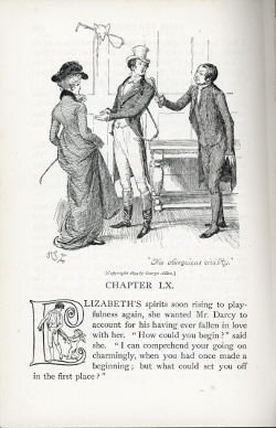
An example of this kind of emphasis occurs in Chapter 55 of the Thomson edition, which opens with a picture captioned “The obsequious civility” The caption refers to Mr. Collins, who is bothering Darcy and Elizabeth after their engagement. This illustration is not of an event worthy of being mentioned when outlining the plot of the novel—or which is even narrated in detail. The line quoted in the caption is almost a throw-away in a paragraph-long description of Elizabeth’s complex feelings during her engagement. Because Thomson chooses to illustrate this phrase, it suddenly takes on greater importance, especially since it is the one moment from the final section of the novel Thomson chooses to emphasize. Much of the chapter in question is taken up with various people’s reactions to the engagement; perhaps more significant to the plot of the novel and the personalities of the main characters is that Darcy’s sister Georgiana is excited about the engagement, or that Jane is not fooled by Miss Bingley’s pretended enthusiasm. Since Mr. Collins is invariably silly and his judgment is not to be depended on, what he thinks would generally be seen as unimportant by a reader of the text alone. But since the illustration repeats his reaction, Mr. Collins’s actions and the comedic aspects of this section of the novel take on a greater importance.
Thomson generally has little interest in illustrating major plot points of the novel; he illustrates Elizabeth and Darcy’s first meeting but not Darcy’s first proposal or Elizabeth’s final acceptance. A single instance of choosing marginal scenes over those important to the narrative may not seem significant, but it happens again and again throughout both the Thomson and Brock editions.2 Because the illustrations do not portray scenes important to the plot, the images (or lack thereof) have a significant influence on the reader’s experience of the novel. The illustrations seem to run parallel to the text as opposed to engaging it, and since key scenes in the text are not illustrated, they aren’t highlighted through repetition as other scenes are. This emphasis on minor moments and characters creates a story of comic moments involving silly people instead of a narrative about two people who grow and change.
Placement
The placement of illustrations also has an important effect in controlling a reader’s progress through the text. Illustrations can imitate textual narrative techniques, such as when, according to Stuart Sillars, the “dynamic effect is increased by the placing of the image a page before the episode is described, which makes us want to read on” (86); this tactic is similar to the traditional literary technique of foreshadowing. The frontispiece is a common example of Sillars’s “dynamic effect.” Because of its location across from the title page, the frontispiece is seen by the reader before she begins reading and thus inherently shows an unfamiliar event. In some ways, the frontispiece allows the illustrator to begin the narrative in media res; the reader fills in the preceding events through the textual narrative, finds the text which matches the frontispiece, and then pursues the events to their resolution. In such cases, the illustration gives the reader a hint about what will occur, encouraging her to read on in order to see how the illustrated scene plays out in the text or to better understand what is happening in the image.
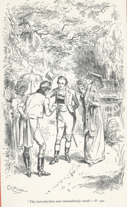
We can see this principle illustrated in C. E. Brock’s frontispiece, which shows two ladies and two gentlemen bowing to one another on a wooded path. The caption reads, “The introduction was immediately made,” and indicates that the scene in question is to be found on page 230; the curious reader could refer to it if she so desired though it is unlikely she would fully understand the significance of the scene without a frame of reference. This illustration is perfect for a frontispiece, as the reader is herself about to—“immediately”—be introduced to the characters of the novel, and introductions and new acquaintances are always ripe with possibilities for change, just what is needed to set a plot in motion. Because the image raises so many unanswered questions, it draws the reader into the narrative. It also alerts the reader to the presence of the scene, so that she may be on the lookout for its explanation of her initial questions. While the scene in question is an important one, the caption gives it an emphasis that does not match the way the scene plays out in the text: the image emphasizes the less important meeting of Darcy and the Gardiners, rather than Darcy and Elizabeth’s interactions.
The concepts of placement and repetition are intertwined, and an image does not have to be a frontispiece to encourage the reader to find a new emphasis she might not see in the textual version. The scenes at Pemberley are particularly important to the development of the novel’s main plot. In the house,
Elizabeth walked on in quest of the only face whose features would be known to her. At last it arrested her—and she beheld a striking resemblance of Mr. Darcy, with such a smile over the face, as she remembered to have sometimes seen, when he looked at her. She stood several minutes before the picture in earnest contemplation, and returned to it again before they quitted the gallery. (250)
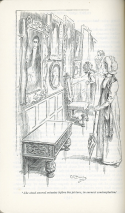
Brock illustrates this scene by showing Elizabeth looking at the picture alone, while her aunt, uncle, and the housekeeper examine other pictures, of which we see only the frames. The caption of the illustration reads, “She stood several minutes before the picture, in earnest contemplation.” While Elizabeth gazes at the portrait, Darcy’s eyes look out of the page, toward the reader. This image appears after the scene described, on the verso of the page which contains the text of the scene, so that the reader cannot see it at the same time as the scene in question. The next page of text begins with the visitors going to see the grounds. Thus, the placement of the illustration reinforces the importance of this episode by repeating it as an image just after the textual version, inviting comparison between the two portrayals and reminding the reader of the scene as she moves on in the text.
Because of the way the gazes in the illustration are structured, with Elizabeth “in earnest contemplation” of Darcy’s portrait and the painted Darcy staring out of the page, the visual elements of the scene are emphasized, and this focus carries over into the next scene. While exploring the grounds, Elizabeth and Darcy meet unexpectedly, and “so abrupt was his appearance, that it was impossible to avoid his sight. Their eyes instantly met, and the cheeks of each were overspread with the deepest blush” (251). Both this scene and that in the gallery are deeply involved with looking, gazing, and seeing. Outside, the eyes of the two meet, as they do in the gallery “when she fixed his eyes upon herself” (251). Instead of contemplating the real man, as she has contemplated his portrait, Elizabeth “instinctively turn[s] away,” and “scarcely dare[s] lift her eyes to his face” (251). This meeting (though unillustrated by either artist) is visually connected with the previous scene in the gallery, a connection emphasized by Brock’s illustration. Darcy has been gazing at Elizabeth for most of the novel, although she and the reader only gradually become aware of this pattern; with the visit to Pemberley this dynamic is reversed. The illustration thus signals a change in the narrative, a point at which Elizabeth begins to think about Darcy. This change exists in the textual version of the novel, but by emphasizing the preoccupation with vision in this section, Brock’s illustration heightens the reader’s awareness of it. The placement of the illustration thus encourages the reader to give more emphasis to this scene, giving it prominence over other parts of the Pemberley section and emphasizing a change in the gazes of the characters in addition to a change in their thoughts, which is the more obvious change seen in the text.
Narrative temporality and the allegorical image
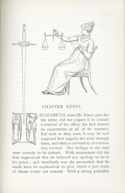
Placement of an illustration, however, does more than move a reader through the narrative. Illustrations can disrupt narrative temporality and pull the reader out of the flow of the novel. Thomson has a fondness for allegorical headpieces and images that dramatize a theme from the text. These images do not represent specific scenes in the novel but rather the sum of several events or an important thematic consideration in a certain section. We can see examples of these thematic illustrations in the heading to Chapter 24, which shows Bingley in a tug of war with his sisters and Darcy (representing their desire to keep him in London and away from Jane versus his desire to return to Netherfield), and in the heading to Chapter 36. Chapter 35 closes at the end of Darcy’s post-proposal letter to Elizabeth, which defends his actions in regard to Bingley and Wickham. The top third of Thomson’s page is taken up with an illustration of a woman—perhaps Elizabeth, perhaps not—holding a letter in one hand and scales in the other. Is the woman about to place the letter on the scales? If so, what will she weigh it against?
While the woman looks like Thomson’s illustrations of Elizabeth, the image is not grounded in the space of the novel through a background, emphasizing the idea that the woman could be mythic, outside the world of the novel. This mythic sensibility is enhanced by the decorations surrounding the letter “I” that opens the chapter; on either side of its upright stroke are humans wearing cloaks and carrying tapers, images more appropriate to the gothic novels parodied in Northanger Abbey than to Pride and Prejudice. The sword embedded in the “I” is no less mysterious, especially since, if it is in the same plane as the woman, her gaze is directed to it. Is this sword the punishment for the person being judged if he does not pass the test? Is the image a representation of Darcy’s letter as an example of the saying “the pen is mightier than the sword”?3
This image, without detailing anything of the plot, gives an impressionistic account of the content of this chapter. Elizabeth spends the chapter thinking over the contents of the letter and weighing her own and Darcy’s behavior. While there is no specific reference in the text to her judging—the usual function ascribed to a female figure holding scales—the purpose of this chapter is for Elizabeth to examine her feelings and actions during her relationships with Darcy and Wickham and to come to a better understanding of them and herself. During this process Elizabeth grows “absolutely ashamed of herself” (208) for her blindness. Since justice is usually blindfolded, the chapter’s narrative presents an interesting dialog with the illustration.
The illustration represents the important aspects of the chapter it begins: its outcome, its thematic significance, and a very specific moment in its plot. While the image provides an excellent visual representation of a theme, it exists outside the time and space of the novel, both literally, since there is no background, and because there is no time lapse between the two chapters it separates. It also creates a pause between the two chapters, something not found in the text-only versions. Understanding the illustration requires that the reader interrupt her reading, effectively pulling her out of the immersive experience of the novel. While Thomson’s allegorical and thematic images provide fascinating representations of themes in the novel, they also disrupt the reader’s experience of the text, enhancing her sense of its artificiality and construction.
Reading a scene
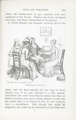
If illustrations, as Julia Thomas claims, “can actively work on the text and, to some extent, even construct its meaning, then it follows that different illustrated versions . . . might create radically different versions of the story” (34). An example can be seen in the illustrations of the scene in which Elizabeth meets Darcy’s sister, Georgiana, for the first time. Thomson captions his illustration “To make herself agreeable to all,” which the text tells us is part of Elizabeth’s goal for the meeting. But Thomson leaves out the fact that Elizabeth also wants to “ascertain the feelings of each of her visitors” and “to compose her own” (262). Thomson’s caption partly emphasizes Elizabeth’s internal, personal dilemma but does not get to the heart of her questions about whether Darcy is still in love with her, why he has changed his manners, and how she can understand her own feelings; instead it emphasizes the social aspect of the event. The emphasis on Elizabeth and her social duties as hostess is also seen in the composition of the image, where Elizabeth sits across from the other members of the party (Mr. and Mrs. Gardiner are not pictured, an interesting omission, since it is partly their reaction that helps the reader interpret the scene). The fact that Elizabeth sits apart from the others indicates her emotional distance from them, given the unresolved nature of the relationships among the characters.
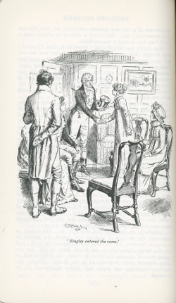
Brock also illustrates a portion of this scene. His illustration is captioned “Bingley entered the room” and shows Elizabeth standing to shake hands with him while the others look on. The composition emphasizes the meeting between Elizabeth and Bingley as they are framed on both sides by seated members of their party. But by choosing to illustrate Elizabeth’s meeting with Bingley, Brock emphasizes her relationship with him, rather than the changing nature of her relationship with Darcy, something much more important to Elizabeth’s internal struggle. Elizabeth is, of course, interested in seeing Bingley, but her (textual) response to his arrival is to think of her sister Jane. Brock’s emphasis on Bingley—we see him from the front, while Elizabeth has her back partly turned toward the viewer—seems to recall the secondary plot surrounding Bingley and Jane rather than the central one surrounding Elizabeth and Darcy. In contrast to the emphasis on Bingley, Darcy, almost totally obscured by the standing Mr. Gardiner, seems reduced to a bit player in his own drama. Indeed, Darcy seems hardly relevant to what is taking place at all, a very different emphasis from the text itself, as well as from Thomson’s illustration of this scene. Since Bingley is the person mentioned in the caption, the one entering and seen most fully by the reader, Elizabeth’s role is also reduced: he acts, she reacts.
While Thomson’s illustration points the reader to at least part of Elizabeth’s inner struggle over her feelings, Brock’s illustration encourages the reader to think less about Elizabeth’s newfound interest in Darcy and more about her connection to her family and its affairs, including the Bingley-and-Jane plot.
For many years, readers and scholars have neglected illustrated editions because they did not believe illustration had anything to offer our understanding of literature. But illustrated editions create new works, imagetexts that provide insight into the period in which they were created and the way in which they were read. Andrew Maunder has argued that Thomson’s edition is an attempt to repackage and pacify Austen’s text as a nostalgic example of “Englishness,” but while the imagetexts considered here do focus on period detail and costumes, they also redraw the novel in other ways. Today’s readers, accustomed from costume dramas to seeing Austen’s characters in period garb, may think less about the Englishness of Thomson and Brock’s drawings and more about the ways in which the illustrations emphasize comedy, orient us toward minor characters and subplots, and underscore thematic issues in the text. These emphases may be in tension with the reader’s previous textual experience of Pride and Prejudice; a reader who has focused more the romantic aspects of the story may become more familiar with the comic moments, while one who sees a critique of society in the text may wonder where that criticism is in the illustrations. At times, the image and text may appear to be in conversation or competition with one another, steering the reader toward different interpretations as the novel unfolds. This tension, often appearing between image and text, offers much more than Henry James’s “pretty reproduction,” as it encourages readers to expand their sense of the possible readings of Pride and Prejudice.
Notes
1. This concept was developed by W.J.T. Mitchell. See his Picture Theory and What Do Pictures Want?
2. Brock provides a scene very similar to the one described above, involving Sir William Lucas instead of Mr. Collins.
3. My thanks to Constance Walker for this suggestion, given during my presentation at the 2013 JASNA Annual General Meeting.
Works Cited
Austen, Jane. Pride and Prejudice. Ed. R. W. Chapman. 3rd ed. Oxford: OUP, 1965. Brock, C. E., illus. Pride and Prejudice. London: Macmillan, 1895. Brooks, Peter. Reading for the Plot. Cambridge: Harvard UP, 1984. Gilson, David . “Later Publishing History, with Illustrations.” Jane Austen in Context. Ed. Janet Todd. Cambridge: Cambridge UP, 2005. 121-59. Maunder, Andrew. “Making Heritage and History: The 1894 Illustrated Pride and Prejudice.” Nineteenth Century Studies 20 (2006): 147-69. Mitchell, W. J. T. Picture Theory: Essays on Verbal and Visual Representation. Chicago: U of Chicago P, 1994. _____. What Do Pictures Want? The Lives and Loves of Images. Chicago: U of Chicago P, 2005. Sillars, Stuart. Visualization in Popular Fiction, 1860-1960. London: Routledge, 1995. Skilton, David. “The Relation Between Illustration and Text in the Victorian Novel: A New Perspective.” Word and Visual Imagination: Studies in the Interaction of English Literature and the Visual Arts. Ed. Karl Josef Holtgen, Peter M. Daly, and Wolfgang Lottes. Erlangen: Universitätsbibliothek Erlangen-Nürnberg, 1988. 303-26. Sutherland, Kathryn. Jane Austen’s Textual Lives: From Aeschylus to Bollywood. Oxford: OUP, 2005. Thomas, Julia. Pictorial Victorians: The Inscription of Values in Word and Image. Athens: Ohio UP, 2004. Thomson, Hugh, illus. Pride and Prejudice. London: Allen, 1894.
|