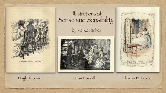
Book illustration is different from other forms of art such as painting and sculpture in its mission of visualizing the story, the characters, the scenes, the events, the atmosphere, etc. It must visually recreate what the author has written in the book, and so it becomes important for the illustrator to do his work skillfully, accurately, and with imagination—goals sometimes in tension. To quote the illustrator Joan Hassall, illustrations “should be specific portrayals of people, places and things” (“On Illustrating” 201). For the novels of Jane Austen, the illustrator must convey not only the scenes and events but also the complex sense of irony and humor, laughter and tears, and the general atmosphere of a particular event. In comparing illustrations of Austen’s Sense and Sensibility by Hugh Thomson, Charles E. Brock, Chris Hammond, A. Wallis Mills, and Joan Hassall, this article shows the range of styles, content, and interpretation the illustrators offer. In addition, it provides readers with a chance to compare seldom seen images side by side.
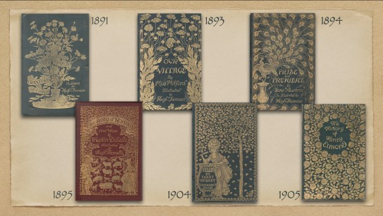
Hugh Thomson (1860–1920) became famous for his illustrations for Mrs. Gaskell’s Cranford in 1891 (above, top left). Thomson described the popularity of his illustrations as an “unexpected delight” (Spielmann 70), and it led to the launch of the “Cranford Series” (some from my collection pictured above). A few of the younger illustrators featured in this series, including Charles E. Brock and Chris Hammond, came to be known as the members of the “Cranford School.” Some of the books in the Cranford Series were published by George Allen, some by Macmillan, and some by other publishers, but the majority were illustrated by Hugh Thomson.
For Pride and Prejudice, published by George Allen in 1894 (top right), Thomson designed the gorgeous cover of a peacock with its feathers spread and created an astonishing 160 drawings (Spielmann 90), including the cover itself, the smaller vignettes at the chapter head, the illuminations for the first letter of each chapter, and the illustrations printed in the text, some full-page and others smaller in size. Thomson originally doubted Pride and Prejudice’s “suitability for illustration” (Spielmann 86). But only a year after the “Peacock Edition” of Pride and Prejudice, he was asked to work on another series by Macmillan, called the “Illustrated Standard Novels.” For this he illustrated the five remaining novels by Austen, and Pride and Prejudice, which he had previously illustrated so brilliantly, was assigned to Charles E. Brock, already regarded as the heir to Hugh Thomson. Much of my collection of illustrated books dates from the 1890s, the so-called “golden age” of illustrated books. They were published in the autumn for the Christmas market and dated to the following year.
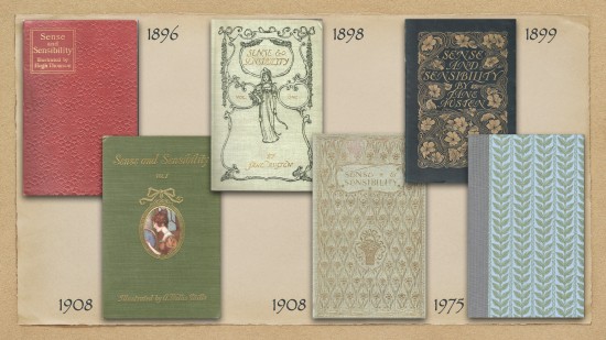
This essay focuses on the six editions of Sense and Sensibility (shown above) from my library: illustrated by (from top left to right) Hugh Thomson in the “Illustrated Standard Novels” (pen and ink drawings, Macmillan), Charles E. Brock (lithographs, ten vols., Dent), and Chris Hammond in the “Cranford Series” (pen and ink drawings, George Allen), and (below) A. Wallis Mills (watercolors, ten vols., Chatto & Windus), Charles E. Brock in the “English Idylls” series (watercolors, six vols. among other writers’ works, Dent), and Joan Hassall (wood-engravings, seven vols., The Folio Society).
At the young age of twenty-one Charles Edmund Brock (1870–1938) was already a full-fledged illustrator and became famous for his depiction of the fine-looking young woman known as the “Brock girl.” He established himself as “a specialist in . . . the tradition of Hugh Thomson” (Dalby 58). For this ten-volume lithograph edition of Austen’s novels from Dent, he illustrated Sense and Sensibility (1898), Emma, and Persuasion; and his brother Henry Matthew Brock illustrated the remaining three novels. Each book has six lithograph prints.1
Lithography is a process of printmaking in which a design is drawn on a flat stone or aluminum. The surface is treated with grease to repel the ink where it is not wanted. Invented by Aloys Senefelder late in the eighteenth century, it was first introduced in England in 1803. One advantage is that an “almost unlimited number of satisfactory impressions . . . can be taken from a lithographic stone” (Ray 51), and during the 1830s it became a popular method. According to Gordon Ray, “By the middle 1840s chromolithography was in general use . . . until it was superseded by the three-color process at the end of the [nineteenth] century” (143). The Brock brothers’ lithograph prints in this series are identified by Gilson as “watercolours reproduced by six-colour lithography” (273).
In 1904 Dent launched “The Series of English Idylls,” and less than ten years after the above-mentioned lithograph edition, Charles E. Brock, working alone, was asked by the same publisher to draw twenty-four watercolors for all six Austen novels, a testament to his popularity with the public. Austen’s novels that he illustrated in this new series from Dent date from 1907 to 1909. Over these two years Brock created an astounding 144 illustrations for this edition of the six Austen novels.
Chris Hammond (1860–1900) was born in the same year as Hugh Thomson. Her given name was Christiana, but she shortened it to the less gender-specific “Chris,” as she felt she was not getting enough commission because of her name. It worked, and she began to receive more work than before—an example of the on-going problem faced by women in a man’s world.2 Her art training at the Royal Academy Schools was cut short because of ill health, and she decided to concentrate on illustration. Unfortunately, because of her short life, she did not leave a large body of work. (See Ruth Williamson’s essay on Hammond in this issue.) A. W. Mills (1878–1940) was a popular artist for Punch and other magazines containing political and social satire. He painted ten watercolors for each of the ten volumes of Jane Austen’s novels—a total of 100 watercolors, a remarkable feat.
In the late 1950s and early 1960s The Folio Society commissioned Joan Hassall to make wood engravings for an edition of Jane Austen’s novels, consisting of seven volumes—the six completed novels and “Shorter Works.” Hassall worked on one book a year, taking seven years (1957-1963) to complete the set. She states, “Each had a frontispiece and eight or nine blocks in the text, also a binding paper, end papers, decorations on the spine and patterned bands for the chapter headings, this last group were done in the first year and remained constant” (“On Illustrating” 204). Hassall began with Sense and Sensibility in 1957, which included eleven illustrations. When The Folio Society reprinted the seven volumes in a boxed set in 1975, Hassall “made additional illustrations for the four longer books.” In the case of Sense and Sensibility, the addition amounted to six pieces, which are slightly larger and lighter in feel because of the easier handling of scraperboard that she used on this occasion (Chambers xxx).
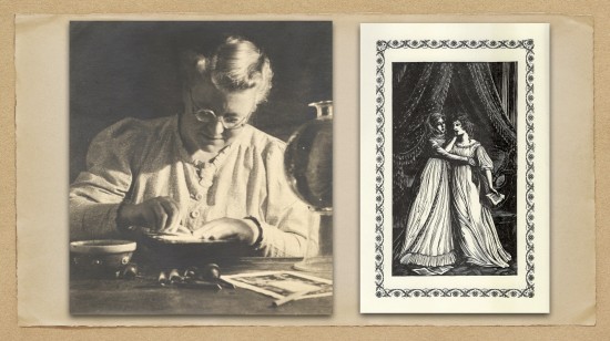
This photo shows Joan Hassall (1906–1988) at work, with strong lamplight focused on her work area. She uses a graver with her right hand over a woodblock or scraperboard, while her left hand rotates “the block on a leather sandbag” (Chambers xvi). One of the tools on the table is a scorper, used for clearing unwanted wood from the block; another is a spitsticker, described as “an instrument fashioned from a narrow, solid bar of steel having a slightly curved cross section resulting in a sharp edge along its lower length” (xvii). The sandbag, the spitsticker, a tint tool, and the scorper, Hassall wrote in 1985, “have been in constant use . . . for forty-six years” (viii). Wood engraving uses the end grain of the block of hard wood, instead of along the woodgrain as in a woodcut, so it can accommodate more details, but often the surfaces are smaller in size. Boxwood was a popular medium for wood engraving, which is what Joan Hassall used.
Hassall was a painstaking artist. She wrote that she “entirely reengraved the frontispiece to Sense and Sensibility because in the first version Elinor was not worthy of my conception of her” (“Illustrating” 217). Here is an artist with commitment, honesty to herself, and pride in her work. Just imagine: she re-engraved the entire frontispiece (above, right), rather than re-engraving Elinor alone, which could have been done in less time.
![]()
We shall now examine how some of the illustrators pictorially recreated the scenes from Sense and Sensibility. I have selected eight episodes from the novel, where three or more illustrators have coincided in choosing the same scene for illustration.
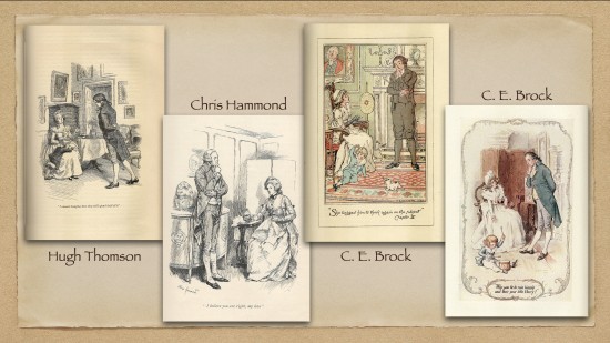
The first scene for examination is that in which John Dashwood’s intention of giving his sisters £1,000 each is gradually whittled away by his wife Fanny to an occasional gift of game and finally to a helping hand when the dispossessed women move out of Norland—which help is “rendered impracticable” (SS 26) as the family moves so far away that household items were conveyed by water.
In all four illustrations John and Fanny Dashwood are placed in a luxurious setting, surrounded by paintings and fine furniture. The illustrators capture Jane Austen’s irony in this episode, in that the financially comfortable couple is trying to rob the three Dashwood girls of whatever comfort their late father intended for them. Interestingly, all four illustrations feature John Dashwood stroking his chin as he listens and Fanny stretching her hand to emphasize her point. Chris Hammond clearly delineates Fanny’s face to indicate her strong objection against the planned gift. C. E. Brock’s watercolor is especially effective, as Fanny specifically points to their son Harry, arguing that giving away the total of £3,000 to the Dashwood girls would deprive Harry of that much money. It’s clear that Fanny simply uses her son as an excuse; she does not want to part with the money. Brock’s illustrations for Austen’s novels are the first to be lithographed and in color (Kelly 61, 63). All four designs remind us of Fanny’s greed and meanness and John’s lack of conviction and breach of trust.
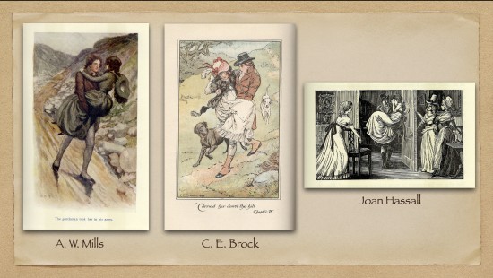
The scene in which Willoughby carries Marianne down the hill after her accident presents a dramatic opportunity. Though Marianne’s accident happens on an open hill, steep but pleasant enough for a walk, A. W. Mills sets it on a narrow dirt road lined with rocks. Note also the awkward, unbalanced physical positioning of Willoughby and Marianne. Charles E. Brock’s lithograph is a more accurate and more romantic representation of the scene. The two figures are skillfully drawn, Willoughby being duly handsome and, as the text indicates, accompanied by two pointers (42). Joan Hassall takes a different approach, showing Willoughby carrying Marianne into the house, as “Elinor and her mother r[i]se up in amazement at their entrance” (42). From Elinor’s offering a chair and Mrs. Dashwood’s surprised look and outstretched arm, it is evident that this is a loving, caring family, despite their differences of temperament and opinions. The design is divided into three panels, and the characters on the left and the right panels look toward the center, thus drawing our attention to Willoughby and Marianne. While Austen describes Elinor and Mrs. Dashwood as looking at Willoughby “with an evident wonder and a secret admiration” at his “youth, beauty, and elegance” (42), it’s unfortunate that Willoughby does not look more handsome here. But in fact, it is very difficult to show the facial features clearly when the artist is working on a small surface only four inches wide and two and three-eighths inches high—the actual size of the surface that Joan Hassall used. (The image was printed without any alteration in size.)
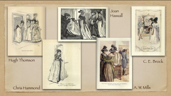
Marianne’s grief after Willoughby’s departure attracts varied interpretations. Only the night before, Willoughby has been visiting with the family, praising their house and saying he would rebuild Combe Magna “‘in the exact plan of this cottage’” (72). And in the morning Marianne stays home, certain that Willoughby will call on her. She might have been in hopes of Willoughby’s proposing to her, which, we learn later, was his plan. His words about an immediate departure thus come as a great shock. Both Hugh Thomson’s and Chris Hammond’s illustrations are pen and ink drawings and similar in design, naturally inviting direct comparison. There is more motion and emotion in Hugh Thomson’s depiction of Marianne’s “violent affliction” (75) that engages you immediately; Chris Hammond’s illustration shows grief, just as deep perhaps, but of a quieter and more dignified nature, not Marianne’s grief.
Joan Hassall shows us Marianne in violent motion, going upstairs crying. Marianne’s motion is evident in her flowing dress and her feet—one foot on the step, and the other about to take the next step. There is movement in all the lines, both straight and curved, remarkable when we remember these lines are the results of carving away the surface material. It is a very well-conceived design.
The Mills and Brock illustrations are both watercolors and show the scene a moment later, when Mrs. Dashwood and Elinor enter the room and find Willoughby at the mantlepiece (75). Though A. Wallis Mills tends to use a wash of watercolors without much nuance, this is one of his better pieces. The questioning posture of Elinor is excellently drawn. Charles E. Brock’s watercolor is more detailed and more delicately drawn, but the straightforward way that A. W. Mills shows the shock of the two women at finding Willoughby is more effective.
The illustrations here by Thomson, Hassall, and Mills share a common element—their inclusion of the family members as they return home from their visit to Lady Middleton. They are surprised and shocked to witness Marianne’s grief, and, seeing them surprised and shocked, our surprise and shock increase—a sort of psychologically augmented effect is in play here.
In many of Joan Hassall’s wood-block illustrations, she chose a scene a moment later than the other artists, possibly because she was a late comer among these illustrators of Jane Austen and hesitated to duplicate the earlier artists. She admired Hugh Thomson and C. E. Brock and may have been reluctant to directly compete with them. In any case, who can blame her for wishing to be different?
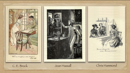
The images above show the scene where Sir John brings the Palmers to Barton Cottage as Elinor “sat at her drawing-table” (105). C. E. Brock’s illustration is true to the text. The absence of the drawing materials, except the paper on the table, can be explained if we guess that Elinor may have put them away inside the drawing table as she was reluctant to invite unnecessary comments or questions from whoever the visitors may turn out to be. Joan Hassall’s wood engraving shows Sir John pointing with his left hand toward the visitors he has brought with him. Although Hassall’s Elinor is not using a drawing table specifically, she was obviously drawing as shown from the objects on the table, and she has just slid her chair back to stand up. These two representations of the scene get at Elinor’s interrupted activity. In both C. E. Brock’s and Joan Hassall’s illustrations, the cordial atmosphere is created by the fact that Elinor and Sir John are leaning toward each other. In the case of Brock, the leaning in both characters is obvious; in Hassall’s piece it is harder to detect, but Elinor’s right hand holding the window and her left arm sliding the chair so she can stand up, together form a gentle lean toward the visitor. Thus, the effect of the two characters leaning toward each other is created.
Chris Hammond’s pen and ink work shows a scene a minute later, when Mrs. Jennings joins Sir John outside the window. There are three problems with this piece as a representation of Austen’s scene. Firstly, there is no sign whatsoever that Elinor has been at her drawing. Secondly, the way she sits on the chair, occupying only half of it, is awkward. Thirdly, she would have stood up with surprise and should have stood as a courtesy at the appearance of Sir John, not placidly remaining in her chair. It is not a convincing portrayal.
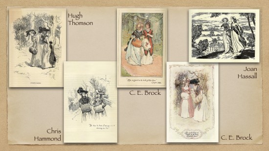
The illustrations of Lucy Steele’s dramatic revelation of her secret engagement as she and Elinor “were walking together from the park to the cottage” (128) present interesting similarities and differences. Hugh Thomson delicately shows Elinor’s shock and doubt by the raised muff in her right hand. C. E. Brock, in both his lithograph and his watercolor, has Lucy showing Elinor the miniature portrait of Edward. In both these pieces Elinor leans over the portrait to make sure it is Edward’s. In the lithograph version, the red color of the stole Lucy wears over her dress not only gives a wonderful color balance but also helps to strengthen the impression of Lucy’s superior position, as she thinks, over Elinor.
Joan Hassall shows us the two girls walking on a hill with a distant view of the Barton house. Lucy wipes her tears, at the same time giving a sly “side glance” at Elinor to see the effect of her words (129). Lucy’s character is quite evident in this depiction. Chris Hammond’s Lucy, however, produces indisputable evidence of the engagement—a letter from Edward, leaving Elinor in no doubt of the engagement, as, according to the custom of the time, an unengaged couple would not correspond.
In these illustrations Lucy looks alternately shy, superior, or self-satisfied because of her prior claim to Edward. The revelation of the secret engagement signals the beginning of Lucy’s triumph over Elinor and what Elinor thinks of as “the persecution of Lucy’s friendship” (302). Till the conclusion of the story, Elinor carries the burden of the secret that she is not free to divulge and, worse still, the misery of the knowledge of Edward’s engagement to Lucy. How Elinor’s sensibility suffers under the weight, and how she copes with her problem with sense is one of the core issues of the novel.
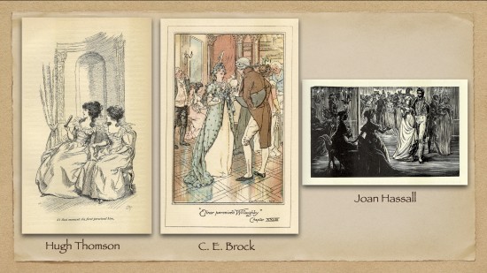
In the illustrations above, Elinor and Marianne are in London at a party when Elinor notices Willoughby “within a few yards of them” (176). Hugh Thomson’s pen and ink drawing shows Marianne happily surprised at seeing Willoughby and Elinor trying to stop her from going to him. It is elegantly drawn with a secure touch, with excellent hatching and cross-hatching and with the focus of our attention solely on the two girls. Marianne’s hand is on Elinor’s knee, and Elinor’s hand touches Marianne’s arm. What Austen tells us through the conversation between the sisters Thomson conveys in a wordless physical communication between them. I consider this an excellent illustration of the scene.
Charles E. Brock and Joan Hassall make Willoughby and Miss Grey much more important to the scene. Brock’s lithograph shows the Dashwood girls looking forlorn in the far back and Willoughby and Miss Grey in the foreground. This design emphasizes the sense of isolation that the two country girls must feel in a London party. Note Brock’s excellent work with the reflection in the foreground, highlighting the shiny floor. In Hassall’s engraving we see the back and side views of the Dashwood girls, with Willoughby and Miss Grey facing us in the midground. The positioning of the sisters forces the viewer to be at the same spot, right behind them if you like, watching the same scene, experiencing the betrayal with Marianne.
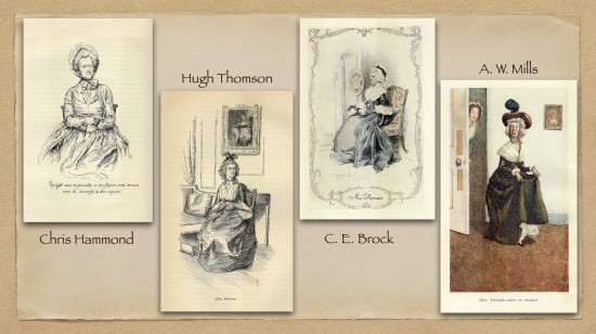
The illustrators visualize Austen’s inspired and ironical verbal description of Mrs. Ferrars as “a little, thin woman, upright, even to formality, in her figure, and serious, even to sourness, in her aspect. Her complexion was sallow; and her features small, without beauty, and naturally without expression; but a lucky contraction of the brow had rescued her countenance from the disgrace of insipidity, by giving it the strong characters of pride and ill nature” (232). In view of these descriptive words, I must say that C. E. Brock’s watercolor gives us the best portrait.
A. W. Mills’s watercolor is the frontispiece of volume two of Sense and Sensibility, for chapter 50, where “Mrs. Ferrars came to inspect the happiness which she was almost ashamed of having authorised”—that is, her visit to the Delaford parsonage where Edward and Elinor, now married, live (375). Mills exercised fully his sense of humor and his gift for caricature, befitting a popular Punch artist.
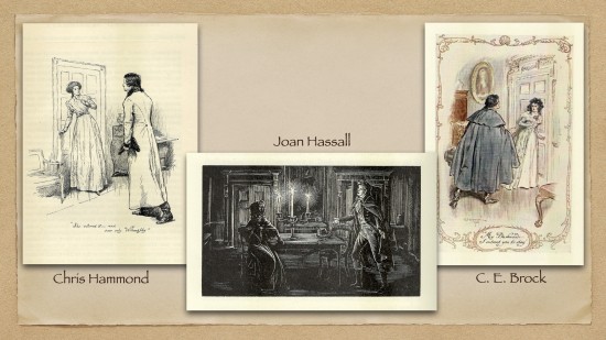
In the final set of illustrations I want to consider, Willoughby bursts in on Elinor during Marianne’s illness. I find Chris Hammond’s depiction too tame. Seeing Willoughby, Elinor should show a much greater surprise, especially because she was expecting her mother at that moment, as well as more anger since she knows he should not be there. In this version Willoughby’s posture looks too deliberate, not showing any sense of urgency. I also have doubts about the floor-length coat he is wearing. Following Ivan Sayers’s lecture at the 2022 JASNA AGM, I asked him if it was possible for a man to ride fast on a horse all day in such a coat. He said it is possible, as the man unbuttons the lower front parts of his coat and pulls them up to fasten them to the two back buttons; the back already has a slit in the center. Mr. Sayers added, however, that it was a coat customarily worn by coachmen. Whether Willoughby will deign to wear a coachman’s uniform even for an all-day fast ride to reach Cleveland is questionable.
Joan Hassall’s wood engraving better shows the sense of urgency in his pleading attitude. But why is Elinor the only one sitting down? After the initial confrontation they both sit down before Willoughby launches into his long explanation (317). It would have made better sense, then, if they were both sitting down or, better still, both standing face to face. The lines Joan Hassall creates by hatching and cross-hatching are admirable, especially the beams from the three candles. We are again reminded of the meticulous work by a steady hand that is required to produce these thin lines. The early nineteenth-century darkness of the interior at night is well depicted.
Lastly, Charles E. Brock’s watercolor follows the text faithfully, where it says, “Elinor, starting back with a look of horror at the sight of him, . . . turn[ed] instantly to quit the room, and her hand was already on the lock” (317), when Willoughby “hastily” advanced toward her. From his posture, it is evident that Willoughby is pleading with Elinor, and yet Willoughby’s figure, clad in a great coat, looks almost threatening in this illustration. At the same time Elinor’s alarm and anger at seeing him is palpable in her facial expression, her posture, and her hand on the doorknob, ready to leave the room. Brock’s draftsmanship is superb, a faithful visual reproduction of the text; he has done full justice to the scene in the story.
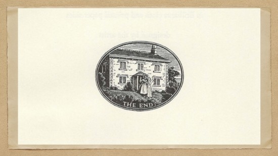
I conclude with Joan Hassall’s engraving for the end of Sense and Sensibility. Northanger Abbey has a similar vignette with four characters but does not have the words “The End.” These are the only Austen novels for which Hassall engraved an ending vignette. The other novels just have the word “Finis” printed, and Persuasion and Shorter Works fare even worse and have nothing to indicate the end. From this it may be surmised that Joan Hassall went an extra mile for Sense and Sensibility.
ACKNOWLEDGMENTS
The photo of Joan Hassall at work and her illustrations are reproduced by courtesy of the estate of Joan Hassall through the kindness of Jim Maslen. I would like to thank my son Jon Kimura Parker for his assistance in the technical aspect of my presentation. He followed my instructions to my utmost satisfaction, organizing the numerous images into a manageable number.
NOTES
1Charles E. Brock’s father, Edmund, was an Oriental languages reader at the Cambridge University Press, and his mother was a Pegram, a family of artists. Besides the illustrators Charles Edmund and Henry Matthew, another brother Richard H. and a Pegram cousin were also artists. Charles E. and Henry M. used to ask their sisters to model when they drew children, and they bought antique furniture and costumes to ensure that their drawings were authentic.
2This strategy recalls that of women who had to hide under such male names as George Sand and George Eliot.
