The recent demise of media mogul Ted Turner recalls that period in the 1980s when he enthusiastically pursued film colorization while film critics like Gene Siskel and Roger Ebert defended the elegance of black-and-white films, arguing that “color so often adds unnecessary information” (“Hollywood’s New Vandalism”).
Adaptations of Austen’s works in recent years, whether films or novelistic modernizations of her plots and characters, very much colorize her writings because Austen’s originals themselves are decidedly colorless. That is, in Austen’s novels, color lexemes—terms like red, yellow, green, brown, pink, orange, and blue—are rare. To investigate this difference, we need to consider (a) what types of work color performs in imaginative fiction, (b) what Austen accomplishes by generally avoiding those effects (or how she used it on those occasions when she indulged in color words), and (c) why those writers repurposing her work often find color worth emphasizing.
Color can be used to build a realistic world for a novel and to mark time, place, and culture—valuable for most writers, but what Austen would regard as “unnecessary information.” Her novels are more concerned with marking character, intellectual power, moral quandaries, and the ability to judge other people. Ted Turner could pursue the colorization of films because the process heightened surface realism (not to mention profitability). After all, most viewers see a world full of color, and one might argue that an entirely grayscale film places a barrier of unreality between viewers and the world portrayed on screen. Austen’s interests lie in a more interior realism, and too much verbiage devoted to world-building for its own sake distracts from that aim. When color lexemes do appear in her novels, they mostly serve characterization rather than description—clustering around figures who are the objects of her satire, and not her protagonists.
Austen could, of course, have simultaneously created a vividly realized world for her characters while also showing their realistic psychology. Other writers of her own time certainly did so. But color can also have a limiting effect precisely because of its power to locate objects in a particular time and culture, as anyone who has owned a harvest-gold stove or an avocado-green refrigerator can attest. Jane Austen may simply have found that color and the information it carries distracted from her portrayal of minds in conflict, or she may have wished her writings to remain more artistically durable by avoiding such exact temporal location. Adapters, by contrast, especially those creating updates, generally seek to situate their texts and films firmly within a specific time and region to enhance immediate audience engagement.
How Austen uses color
Austen herself is not color-blind. Her letters show plenty of attention to color. Although Austen claims to “hate describing such things” (8–9 January 1799), the subject index to Deirdre Le Faye’s fourth edition of the letters shows entries for fabrics in black, blue, brown, dark slate, lilac, purple, and rose, and in yellow and white. Her letters mention a coquelicot feather (18–19 December 1798), green shoes (8–9 January 1799), and purple ribbon (2 June 1799). While ladies’ clothing dominates in the letters, other items also get color descriptions. Austen writes to Cassandra about Tom Lefroy’s annoying “white Coat” (14–15 January 1796) and “a well-known, commodious green Vehicle” (14–16 January 1801). Fanny Knight learns about gamekeeper Triggs’s “Green Coat” (23–25 March 1817) making a “handsome” show at a Chawton funeral.
Austen’s letters tell us that she found Mrs. Bingley’s portrait in the 1813 Great Exhibition in Spring Gardens, in which she was wearing “a white gown, with green ornaments, which convinces me of what I had always supposed, that green was a favourite colour with her” (24 May 1813).1 She adds that Mrs. Darcy, could she be located, “will be in Yellow”—but Austen’s novel will not even tell us the color of her hair, let alone the color of her gown.
The avoidance of color in her novels is quite conscious. Using Voyant Tools, a textual analysis app, we examined the relative frequency of a specific word in a group of texts (Figure 1). This method allows valid comparison of works of different lengths and gives a snapshot of Austen’s practices. (Disclaimer: we have aggregated the color data for ease of viewing, since Voyant cannot show small segments clearly; also, the visualizations cannot separate adjectives from proper nouns [e.g., Miss Grey, Gretna Green], so some columns slightly exaggerate a color’s occurrence.) As the chart shows, Austen’s use of common color words is remarkably dense in her letters when compared to the novels, with Pride and Prejudice the thinnest and Northanger Abbey the thickest.2
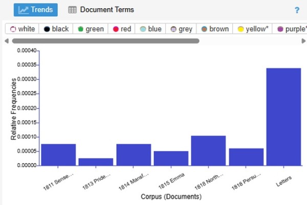
Figure 1. Relative density of some sample color words used in Austen novels.
(Click here to see a larger version.)
In an 1814 letter, she advises her niece Anna Austen, a budding young novelist, to eschew needless detail:
We have been very much amused by your 3 books, but I have a good many criticisms to make—more than you will like. . . . You describe a sweet place, but your descriptions are often more minute than will be liked. You give too many particulars of right hand & left. . . . We like the Egertons very well. We see no Blue Pantaloons, or Cocks & Hens. (9–18 September 1814)
Le Faye, in her notes, sees a family joke in the pantaloons and poultry (441), but we see praise for Anna’s descriptive restraint in the sections of the draft novel Austen has been critiquing. Less is more: we do not need a navigable map of the landscape. We do not need to know what Mr. Egerton is wearing or what animals populate the farmyard. Austen’s theory of writing is to avoid particulars of description for the sake of mere description.
Austen is unusually stingy with color words compared to other novelists, and the following visualizations make that apparent. We picked three sample novels—Sir Walter Scott’s second novel, Guy Mannering (1815); Austen’s Persuasion (1818); and Charlotte Brontë’s Jane Eyre (1847)—and visualized their density of six color words with Voyant Tools (Figure 2). The Scott and Brontë novels have dramatically different densities of color words compared to Austen’s novel, with Jane Eyre having the greatest density as well as the greatest variety of color words used. Austen’s spareness is not a matter of nineteenth-century prose style; it is an artistic choice.
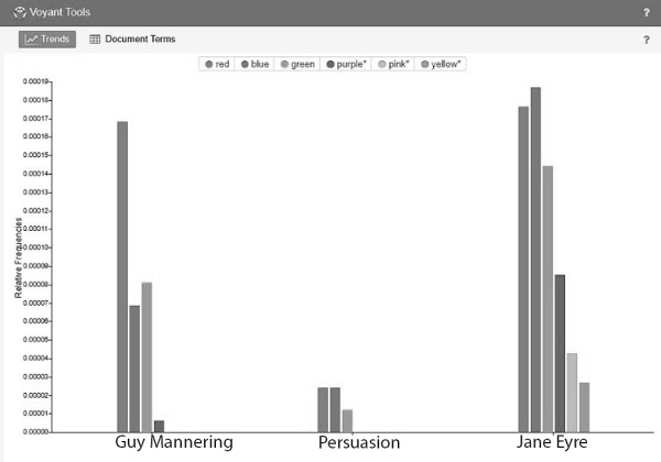
Figure 2. Austen, Scott, and Charlotte Brontë compared in the use of some sample color words.
(Click here to see a larger version.)
For another comparison, consider Persuasion and a novel published within a few days of it in 1818—Mary Shelley’s Frankenstein (Figure 3). For this visualization, we offer actual word counts, not density. We also present our data in an Excel chart, since a sole use of a word does not register visually in Voyant—and there are many color words used only once by Austen. Persuasion has a slightly larger total word count than Frankenstein, but it contains far fewer color words than Frankenstein despite its length advantage, so the difference is even more striking than the chart indicates. Only with red does Austen pull sharply ahead of Shelley: she gives us noses red from a cold and faces red either from embarrassment or a life at sea. Shelley’s sole use of red describes autumn leaves; Austen’s leaves are “tawny,” a most lackluster description of fall foliage, and part of a passage of irony at the Romantically melancholy heroine’s expense: “Her pleasure in the walk must arise from the exercise and the day, from the view of the last smiles of the year upon the tawny leaves and withered hedges, and from repeating to herself some few of the thousand poetical descriptions extant of autumn” (84). Poor Anne.
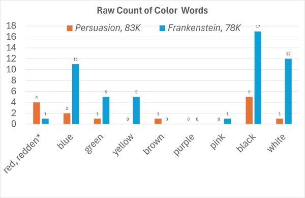
Figure 3. Numbers of sample color words used in Persuasion and Frankenstein.
(Click here to see a larger version.)
Finally, let us look at the one novel that barely uses color words at all. In Pride and Prejudice, we get red three times: twice for the coats of officers and once to describe Mr. Darcy’s (or possibly Mr. Wickham’s) face when the two men meet in Meryton: “Both changed colour, one looked white, the other red” (73). Scarlet and blue are each used twice (for men’s coats) and white three times (for frost, soup, and a face—never for gowns). Green, brown, and black each appear once; yellow, pink, grey, and purple are absent.
Are these numbers a lot or a little? Compare Pride and Prejudice to Jane Eyre, admittedly half again as long, but the difference is still striking. Jane Eyre has 35 uses of blue to Austen’s 2; 72 of white to Austen’s 3; and 16 instances of purple—Austen uses purple a total of 4 times in the six novels. As Sandie Byrne aptly puts it, “Compared with Austen’s worlds, those of her near-contemporaries are polychromatic” (120).
Unlike her contemporaries and followers, Austen does not do much description. Mary Lascelles notes: “Passages describing the visible world are . . . rare” (178). When writing fiction, Austen seems almost suspicious of color. If the words can indicate mental conditions, fine: her narration occasionally has men turn red with anger, agitation, confusion, or displeasure. Women have eyes red from weeping or noses red from sniffling. Mostly, Austen plants color words into the dialogue, free indirect discourse, and thoughts of specific characters as signals about how to judge them. And it will not be the characters who serve as the moral centers who are using these words. Take, for example, Isabella Thorpe in Northanger Abbey. She speaks many, many fancy color words in Northanger Abbey: yellow, coquelicot, puce, purple—“‘I wear nothing but purple now: I know I look hideous in it, but no matter—it is your dear brother’s favourite colour’” (218). And it is the dim Mrs. Allen who notices that Miss Tilney “‘always wears white’” (91). To focus on color is to be, literally and metaphorically, superficial.
The pattern holds true in the other novels, too. Lydia’s focus on whether her dear Wickham will “‘be married in his blue coat’” (PP 319) does not speak to her credit. Mrs. Elton plans to have a “‘pink ribbon’” (E 355) on her strawberry basket, and she carries a “purple and gold ridicule” (453). Anne Steele has pink ribbons, too, since pink is “‘the Doctor’s favourite colour’” (SS 272). And let us not forget Mr. Rushworth’s preoccupation with his “‘blue dress, and . . . pink satin cloak’” (MP 138, 139). In Emma, it is Harriet who talks about the yellow curtains of the vicarage and fusses over blue ribbons and her yellow pattern dress at Ford’s. Emma herself gets pulled into being superficial by association. The word blue appears four times in the novel—three of those presented in Emma’s point of view as she considers Harriet’s soft, blue eyes.
Austen also uses color words ironically. Henry Tilney’s mock-gothic description of the Abbey parodically includes a “‘bed, of dark green stuff or purple velvet’” (NA 158). You would expect a few blue skies in Austen’s novels, but that phrase shows up only twice: Marianne and Margaret think they see patches of blue sky shortly before being caught in a downpour (SS 41; Byrne 120), and Catherine learns from the connoisseur Tilneys that “a clear blue sky was no longer a proof of a fine day” (NA 110). This is perhaps her most interesting method for deploying these adjectives—to warn that the surface is not what it seems. For Austen the letter-writer, color is perfectly suitable: she does not have to construct minds and indicate how to judge people’s psychology. For Austen the novelist, however, color words need to pull their weight and do more than serve as decoration. Were Austen to mention blue pantaloons in a novel, it would be to make a pointed, possibly ironic comment about the describer, not to set a scene.
Color, especially when used to describe clothing, can also date a work, another reason for Austen to avoid specific mentions. Fashions in colors come and go. Austen notes in a December 1798 letter to Cassandra that she plans to redo a headpiece for a ball: “instead of the black military feather [I] shall put in the Coquelicot one, as being smarter;—& besides Coquelicot is to be all the fashion this winter” (18–19 December 1798). Incidentally, the Lyme Regis Museum has on display a coquelicot feather cockade said to have belonged to Austen (Figure 4).3 Austen mentions the elegantly named poppy-red color again in 1803 in the color-heavy novel that will eventually be named Northanger Abbey (39). The color was at its peak in the late 1790s (Waldock) but continued to be referenced in ladies’ magazines between 1795 and 1805 as a “fashion favorite” (Knight).
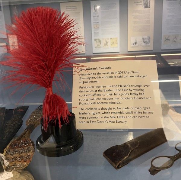
Figure 4. Coquelicot feather cockade, donated to the Lyme Regis Museum by Diana Shervington, a double descendant of Edward (né Austen) Knight. Photo courtesy of Anna Bhawan from her blog Austenised; reflections removed with ChatGPT’s image editor.
(Click here to see a larger version.)
By the time Austen retrieves her manuscript from Crosby and Co. near the end of her life, however, mentions of the color have been on the decline for years, as this n-gram of word densities over time in the Google Books corpus demonstrates (Figure 5). Perhaps the term coquelicot is one of the things Austen has been thinking about as she jots on the manuscript that some parts have become “obsolete” (10). She may have learned from that aborted publication experience to minimize references to fashion and color because they can make a book become dated.
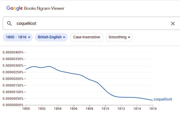
Figure 5. Density of the word coquelicot in the Google Books database between 1800 and 1816.
(Click here to see a larger version.)
Color in film adaptations
Modern Austen films, at least after the 1940 MGM Pride and Prejudice, cannot so easily avoid filling in details of color; nor for them is it “unnecessary information.” By and large, color in Austen adaptations needs to do temporal and cultural work that Austen did not need to do or actively avoided.
Early heritage-style film adaptations choose a low-key palette—not, we think, out of deference to Austen’s minimalist color use but to indicate that the subject matter has a historical setting. It is as if the cloth of the Regency has faded with time: that is how old stuff should appear. White muslin and black coats seem to be the most common fabrics on display, and colors are mostly muted. In the groundbreaking BBC 1995 Pride and Prejudice, we watch in the opening credits the white and pastel pink fabric being embroidered with brown, pale green, pale yellow, white, and tawny thread. Neutral colors dominate in the opening shots and in ballroom scenes.
When bright colors show up, however, they make a statement—the scarlet coats of army officers stand out, setting them apart and marking them as not of Meryton. Likewise, Caroline’s and Louisa’s brightly colored gowns mark them as outside Elizabeth Bennet’s world (Figure 6). They are not characters who blend in—nor do they plan to. This production set the stage for what we expect Austen on film to look like: “slightly faded fabric,” a key feature of “heritage” but with flashes of color for storytelling effect. Color does work in these films, but it is doing different work from what Austen had it do.
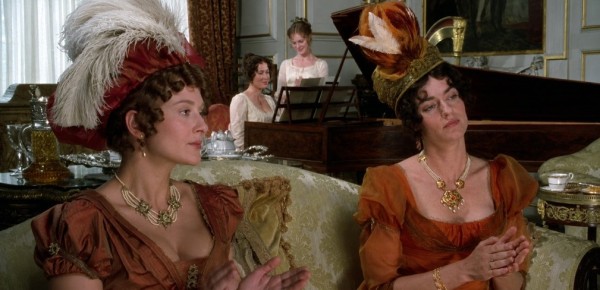
Figure 6. The Bingley sisters wear coordinated gowns at Pemberley (Pride and Prejudice [BBC, 1995]); screenshot resolution enhanced with ChatGPT’s image editor.
Joe Wright’s moody 2005 Pride & Prejudice also pushes a muted palette. The muddy colors chosen are less delicate than in their predecessor TV series but serve a more Austenian function of directing the viewer to the interiority of the characters. The difference, however, is that the focus is on the principal characters, whose serious mental states are conveyed to viewers not by dialogue or voiceover, but by the presence of earth tones and dark hues—a serious figure dressed in brown (Figure 7) or a man in dull hues in the morning mist. Austen used color to delineate secondary characters and convey irony; Wright’s film instead uses it sincerely to convey information about the principals.
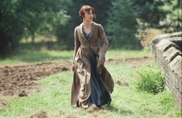
Figure 7. Elizabeth Bennet is down to earth in muddy hues (Pride & Prejudice [Focus, 2005]). Image from LiveJournal.
The Regency, however, was a time of color. Costume researcher Beatrice Knight has assembled a long list of terms used in Regency magazines that show the range of bright colors then in fashion. Similarly, the Prince Regent’s Brighton Pavilion showcased green, pink, red, purple, and yellow, to name only a few of its hues. In fact, its “Kaleidoscope of Colours” was the focus of a 2025 exhibition curated by color historian Alexandra Loske (Sharrock).4 And our present era is also highly chromatic: we have digital monitors capable of showing us 16.7 million different colors, and even the venerable Wall Street Journal has been printing in four colors since 2002. Several recent film adaptations and novelistic updates have moved toward a more colorful vision of Austen, recreating history with color instead of by muting it.
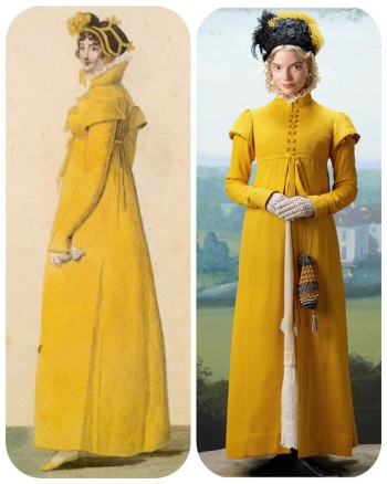
Figure 8. Fashion plate from Journal des Dames et des Modes (1809); Anya Taylor-Joy’s costume designed by Alexandra Byrne for Emma. (2020). Images courtesy of the Facebook page “Tea with Jane Austen.”
Autumn de Wilde’s 2020 Emma. is a wonderful world of color. The film is stunning, thanks to being shot digitally instead of on physical film, and details of fabric are lovingly portrayed. De Wilde gives us a Regency Vogue version of Austen’s novel. It is not the traditional “look” for period drama, but it is an accurate portrayal of Regency costume, if perhaps not that likely to be found in a small provincial town. As a result, this film has the visual appeal of the modern but also maintains some historical accuracy. For example, the girls of Mrs. Goddard’s school are striking in their matching red cloaks—correct to the period and suitable garb for schoolgirls—and contrast nicely with Anya Taylor-Joy’s Emma in her sophisticated yellow hat and pelisse, which are modeled directly on a French fashion plate (Figure 8). Film can remind us every now and then that the Regency was not faded or grungy, but bright and vivid.
This 2020 film has predecessors in period-drama vibrancy, particularly the 2009 BBC serial of Emma, which is relatively colorful; mostly, however, the updates are the versions that exploit color to create a world. Most famously, Clueless, from 1995, is color-forward as it creates a fantasy version of Beverly Hills high-school life. Cher’s yellow plaid Junior Gaultier suit5 sets her apart from the others, as color did in heritage Austen films, though in reverse: Cher is the ultimate insider in her community, as is Emma Woodhouse (Figure 9). It also signals an adorably superficial wearer who wants to attract attention. Austen would have recognized the satiric method because she used it herself in the novel, though not for the character of Emma, whose appearance and wardrobe are indeterminate. Incidentally, Clueless, not Austen, defined the “look” of every Emma Woodhouse for the next thirty years: blonde-haired and smartly dressed. One can even see a nod to Clueless in the choice of the fashionable yellow in the 2020 Emma.

Figure 9. Cher Horowitz wears her celebrated yellow plaid suit (Clueless [Paramount, 1995]); screenshot resolution enhanced with ChatGPT’s image editor.
The script of Clueless, especially at the beginning of the film, directs our attention to the style and fabric of the clothes, from Cher’s voiceover on Dionne (“I must give her snaps for her courageous fashion efforts”) to her comment to Josh: “So, the flannel shirt deal. Is that a nod to the crispy Seattle weather?” That latter bit of dialogue even uses clothes to make the distinction between two different West Coast cities. Of course, the colorful and stylish clothing and vehicles, the bright flowers, and the perpetually blue sky do most of the work in positioning the viewer in a fantasy version of Los Angeles—but the clothing, especially Cher’s yellow suit, has become the defining feature of the adaptation.
Likewise, Gurinder Chadha’s 2004 Bollywood-inspired update Bride & Prejudice revels in and exaggerates bright hues, in this case those of India. Color is part of the culture, as one musical number notes: “A marriage has come to town / Laughter, color, light, and sound.” It insists that “bright colors can never be forgotten,” and the viewers see those colors in the flowers, food, and costumes of the three women at the center of the dance and the extravagant color wheel of costumed Indian humanity at the end of the number (Figure 10). For a Western audience, the visual sense reminds us we are not in England’s green and pleasant (and relatively monochromatic) land any more. In both these adaptations of Austen, color becomes a way of defining places, both very non-Austenian places.
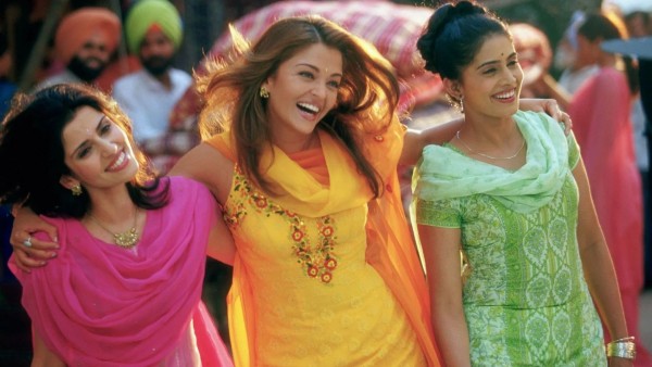
Figure 10. Bright Indian garb in “A Marriage Has Come to Town” from Bride and Prejudice (Miramax/StudioCanal, 2004). Image source: “A Year of Romantic Comedies.”
Color in novelistic Austen updates
As with both film modernizations discussed above, novels that update Austen to modern cultures tend to move the stories and equivalent characters to urban, non-English, or ethnic-community settings, and color leads the way in those relocations. These narratives emphasize the material conditions of life in those communities in a way that Austen does not—abounding in sensory descriptions of clothing, food, and furniture, and evoking a wide color scheme that matches our color-focused world.
Karen Tei Yamashita’s Sansei and Sensibility (2020) shifts Austen’s story to a Japanese American community in California during the 1960s. Here is the opening of her short-story reworking of Sense and Sensibility, “Shikataganai & Mottainai”:
Mukashi, mukashi [Once upon a time] as they used to say in our little world of teahouses and dainty gardens of pine bonsai and azalea, dappled in puffy mounds of lime-green dichondra, lacquered bridges expanding serene ponds of fat polka-dot koi resting in the shadows of waterlilies, leaning red maple and purple wisteria. . . . A flutter of banana yellow butterflies . . . scatter[ed] over the pond, when suddenly, a gigantic white koi broke the surface, its large albino lips and gullet open and flaring, and handily gulped down the largest of the butterflies, though perhaps only the impudent size of a baby canary. The sisters watch the delicate wings fold and crush and the koi’s pink eye blink and disappear. (115)
Notice the riot of color—lime-green, red, purple, yellow, white—and the description of plants and fish. It paints a beautiful picture—until that final, alarming moment when the “banana yellow” butterfly (Mr. Dashwood) meets his fate.
Kamila Knows Best, by Farah Heron, also adopts a setting of outsiders within a larger community. It is set in the Toronto Muslim community, and its protagonist navigates life in Canada in 2022, while remaining true to her Pakistani heritage. She is a good daughter to her ailing widowed father, an Instagram queen, and a wonderful hostess. She is Austen’s Emma updated for the present day. And the present day is colorful. The novel takes us into the heart of urban culture—cool people with cool jobs who dress in cool clothes and live in cool houses. Here is a scene in which Kamila preps her house for one of her trendy parties:
She put out some Indian-print throw cushions she’d found while clothes shopping with Maricel after their dinner and scattered some candles about. Finally, she put out big golden bowls of huge magenta gerbera daisies. . . . Dad came down the stairs as she was putting jewel-toned coasters on every horizontal surface in the room. (44–45)
Everything is patterned or brightly colored, though most of the décor is for effect rather than use. It echoes her heritage as well as modern consumer culture. This feels like Jane Austen rewritten by Robert Ferrars. While aware of Austen’s critique of materiality, the author cannot help but fill Kamila’s life with clothes and home accessories, all described in loving and colorful detail. Yes, Kamila is superficial, but the surface is delightfully attractive, like the book’s cover, featuring Clueless colors (Figure 11).
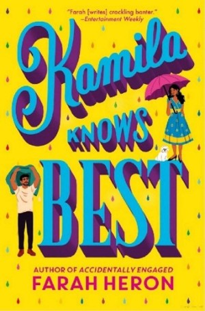
Figure 11. Cover of Kamila Knows Best. |
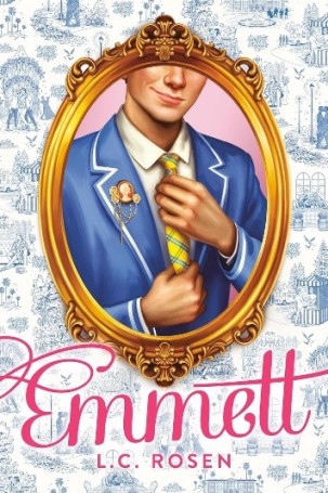
Figure 12. Cover of Emmett. |
Austen novels updated and adapted for the young-adult market constitute a current trend, and color is especially rich in these books too. Emmett, by Lev Rosen (2023), another update of Emma, resituates Austen’s story in the LGBTQ circle of a posh California private school and abounds with color—but Clueless color, not Austen color.
Taylor’s . . . got super-cute earrings on today, too. They’re little yellow crystals that match her [school] uniform. Technically, we have a whole wardrobe to choose from . . . , always a white shirt, but then it’s mix and match: ties in yellow, blue, or yellow-and-blue plaid. Pale gray suit (pants or skirt) . . . [or] yellow-and-blue plaid suit. (32)
You cannot have a modern Emma any more without extremely fashionable clothing or yellow as a focal color (Figure 12). But the description in the novel is largely for the sake of description—“blue pantaloons,” as Austen might mutter (by the way, blue is used 19 times and pink 15 times in Emmett).

A modernized Austen is a colorized Austen, a sensory Austen, and this trend spills over to the presentation of Austen’s own novels. Penguin Books offers Austen in the classic, low-key covers but also has some titles with newer, eye-catching colorful ones that give the books a modern feel (Figure 13) and BookTok appeal. Their Puffin line, aimed at a younger audience, packages Austen in vibrant, multicultural covers to attract early-career readers: “Fall head over heels for First Impressions, Puffin’s boldly designed new YA Jane Austen collection” (Figure 14). And the trend is not confined to the United States. For example, Le Livre de Poche’s 2025 reissue of Emma as translated by popular young adult writer Clémentine Beauvais also sports a cover that leans into the bright pink (Figure 15). We suspect that younger readers around the world will be surprised to learn how little these books and designs reflect their author’s spare style. They would be wise not to judge a book by its cover.
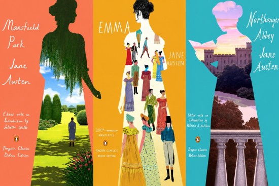
Figure 13. Covers of the Penguin Classics Deluxe Editions of Austen.
(Click here to see a larger version.)
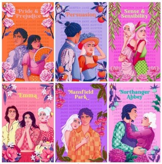
Figure 14. Covers of Puffin's First Impressions series of Austen. |
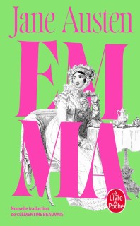
Figure 15. Cover of Le Livre de Poche’s French translation of Emma. |
In her restraint with color words, Austen is a strange novelist, abnormal for her own time and, as we have shown with these adaptations, for ours too. The greatest literature cannot be normal, by definition—great books will be different and break paradigms. Austen trusts her readers to be sharp elves and to understand her method. Put in the mouths and minds of characters, color lexemes are a way of signaling which characters are silly or shallow; in the voice of the narrator, they generally serve as an irony alert. Color words do not get used to paint a scene or create a mood; Austen leaves such descriptions to others. For her, it is about showing character.
As a global phenomenon and the source of so much adaptation, however, Austen has become a template for us to fill in as we please. She probably would tell us, though, that we are using too much pink and purple and coloring outside the lines.
NOTES
1Rodney Yoder et al. have researched possible paintings in “Revisiting Mrs. Bingley’s Portrait.”
2We used the Brabourne edition of the letters with Voyant, since Le Faye’s fourth edition is not available digitally for uploading and data analysis. We were, however, able to search words within Le Faye’s third edition by using the copy in the Open Library.
3It would be delightful if these were indeed the feathers Austen mentions in her letter; the James Stainer Clarke watercolor thought to be of Austen (Ray and Wheeler) also shows coquelicot cockades in the hat.
4Also see Alexandra Loske’s accompanying book.
5Cher’s yellow suit is not from Dolce and Gabbana, as often claimed, but from Junior Gaultier (English Rake).
